Step-by-Step Tutorial: Rendering Realistic Trees in Art – Mastering Form, Lighting, and Shading Techniques

In the realm of digital and traditional illustration, rendering trees convincingly is a cornerstone skill that elevates landscapes from flat sketches to immersive, lifelike environments. Trees, with their organic complexity, pose unique challenges: capturing the interplay of light and shadow, building volume through layered forms, and balancing detail with overall structure. This comprehensive tutorial, inspired by proven artistic methodologies akin to those used in concept art and environmental design (e.g., in animation studios like Studio Ghibli or game development pipelines), breaks down the process into manageable steps. We’ll explore how to deconstruct a tree into basic shapes, apply tonal values based on light direction, and progressively add texture and refinement. Whether you’re a digital artist using tools like Photoshop, Procreate, or Clip Studio Paint, or a traditionalist with pencils and brushes, these techniques will help you create trees that feel three-dimensional and responsive to their environment.
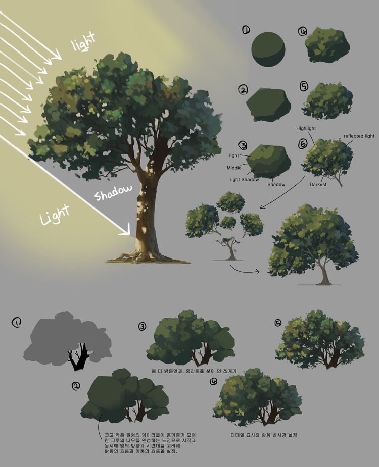
The tutorial is structured around key principles of light behavior on organic forms: direct light creates highlights, midtones form the base, shadows add depth, and reflected light brings subtlety. We’ll reference a visual guide that progresses from abstract shapes to fully rendered trees, emphasizing the importance of starting broad and refining later. This approach prevents over-detailing early on, a common pitfall that leads to stiff or unconvincing results. Essential tools include: a drawing tablet or paper, brushes for broad strokes (e.g., soft round for blending), and a value scale for reference. Practice in grayscale first to master form before adding color—greens can vary from cool shadows (bluish) to warm highlights (yellowish).
Core Principles of Tree Rendering
Before diving into the steps, grasp these foundational concepts:
- Light Source Consistency: Always define your light direction early (e.g., top-left for outdoor scenes mimicking sunlight). This dictates where highlights peak and shadows fall.
- Value Hierarchy: Use a range of tones—highlight (brightest), light, midtone (base), shadow (dark), and core shadow (darkest)—to build volume. Reflected light (bounced from ground or nearby objects) softens edges.
- Form Simplification: Trees aren’t random; break them into clumps or “masses” of foliage, treating each as a geometric shape (spheres, cylinders) for easier shading.
- Silhouette and Gesture: Prioritize the overall outline for readability; a strong silhouette ensures the tree “reads” well even from afar.
- Texture Progression: Start with broad blocks, add leaf clusters last to avoid muddiness.
- Common Errors to Avoid: Ignoring light direction (flat shading), adding details too soon (losing form), or uniform density (real trees have gaps for light penetration).
- Artistic References: Draw from nature observation or studies like those in “How to Draw Trees” by Frederick J. Garner, adapting for digital workflows.
Aim for 10-15 minute sketches per step to build muscle memory. Let’s proceed to the breakdown, numbered to match the visual examples.
Step 1: Establish the Basic Silhouette (Simple Shape Foundation)
Begin with the tree’s fundamental form to anchor your composition. This step focuses on mass rather than detail, ensuring proportionality.
- Visual Breakdown: Start with a basic rounded shape, like a smooth circle or oval, representing the canopy’s overall volume. Ignore branches for now; think of it as a solid blob.
- Technique: In your medium, lightly sketch the outline in a neutral midtone (e.g., 50% gray). This serves as your “midtone base,” filling the entire shape uniformly. Why midtone? It allows easy addition of lighter and darker values later, creating a neutral canvas.
- Lighting Introduction: Note the light source—here, coming from the top-left at a 45-degree angle. Label potential areas: the top-left edge for future highlights, bottom-right for shadows.
- Tutorial Tip: Use a soft brush or pencil to fill; avoid hard edges. If digital, lock the layer for non-destructive editing. Practice variations: Tall, narrow ovals for pines; wide, irregular for oaks. Translation from guide: “1) Fill the basic shape with midtone. Light and shadow.” This reminds us to prepare for value layering without committing to extremes yet.
Step 2: Refine the Shape into Geometric Masses (Building Structure)
Transition from smooth to faceted forms to suggest foliage clumps, adding subtle complexity without overwhelming.
- Visual Breakdown: Evolve the circle into a rough polygon or irregular polyhedron, with flat facets indicating large leaf masses. This creates a low-poly look, emphasizing planes.
- Technique: Subdivide the base shape into 5-8 facets. Apply slight value variation: lighter on facets facing the light, darker on those turned away. Keep it simple—no textures yet.
- Lighting Application: Introduce basic shading: top facets get a light wash, sides midtone, bottom darker. This builds initial volume, making the form pop as a 3D object.
- Tutorial Tip: In traditional media, use hatching for facets; digitally, use the lasso tool to select and fill. Experiment with asymmetry—nature isn’t perfect. This step trains your eye to see trees as clustered volumes, not individual leaves.
Step 3: Apply Core Values (Light, Midtone, Shadow Division)
Now, define the tonal map to establish depth and light interaction, turning the abstract shape into a believable form.
- Visual Breakdown: Label and shade distinct zones: “Light” (upper areas), “Midtone” (core body), “Light Shadow” (transitional undersides), and “Darken” (deep recesses).
- Technique: Using your value scale, assign tones: Highlights at 10-20% darkness, midtones 40-60%, shadows 70-90%. Blend softly for gradients, but maintain clear separations for clarity.
- Lighting Application: With light from top-left, the left side brightens, right darkens. Add a subtle core shadow where light can’t reach, like under dense foliage.
- Tutorial Tip: Squint your eyes to check value contrast—if it reads as a tree from afar, you’re on track. Translation from guide: “2) Let’s find clumps of large and small forms. Make the light side bright, the dark side with dark colors.” Focus on massing: Group small shapes into larger ones for efficiency, preventing a speckled look.
Step 4: Add Texture and Refinement (Foliage Clustering)
Introduce organic texture by breaking masses into smaller subclumps, enhancing realism while preserving form.
- Visual Breakdown: Overlay rough, bushy textures on the faceted shape, suggesting leaf groups. The form becomes more irregular, with protrusions and indents.
- Technique: Use a textured brush (e.g., foliage stamp) or cross-hatching to imply leaves. Vary density: Sparse on lit sides for airiness, dense in shadows for weight.
- Lighting Application: Enhance with reflected light—subtle brightening on shadow undersides from ground bounce. This adds nuance, preventing flat blacks.
- Tutorial Tip: Work from large to small: Block big clusters first, then subdivide. Digitally, use layers for textures. This step bridges abstraction to representation.
Step 5: Incorporate Advanced Lighting (Highlights and Reflected Light)
Elevate the rendering with nuanced light effects, making the tree dynamic and integrated into its scene.
- Visual Breakdown: A more detailed bush or tree emerges, labeled “Highlight,” “Reflected Light,” and “Darkest.” The canopy shows bright specs on tips, soft glows underneath.
- Technique: Add pinpoint highlights on outward-facing leaves, using white or near-white. For reflected light, apply a cooler, muted tone (e.g., pale blue-green) in shadows.
- Lighting Application: Darkest areas (core shadows) get deepest values, contrasted against highlights for pop. Ensure light consistency across the entire tree.
- Tutorial Tip: Observe real trees at different times; morning light is warm, evening cool. Translation from guide: “3) For the surface that the line of sight reaches and the opposite surface, let’s erect the leaves.” This means orient leaves directionally: Point them outward on viewer-facing sides for dimension, inward on backs for occlusion.
Step 6: Finalize with Full Detail and Silhouette Polish (Complete Rendering)
Bring it all together, adding finishing touches while ensuring the overall form holds.
- Visual Breakdown: Progress from gray silhouette to fully colored, textured tree. Include trunk integration, root flares, and environmental shadows.
- Technique: Layer fine details like individual leaves or bark, but sparingly—focus 80% on masses. Refine edges: Soft for distant trees, crisp for foreground.
- Lighting Application: Cast ground shadows based on canopy shape, elongated per light angle. Add ambient occlusion for realism.
- Tutorial Tip: Step back frequently; zoom out digitally. Translation from guide: “4) Details are last. Capture the overall silhouette first.” This golden rule prevents losing the big picture—always thumbnail your silhouette in black-and-white to verify strength.
Additional Examples: Applying to Bushes and Variations
The guide extends to bushes: Start with a squat silhouette (Step 7: Gray mass), add midtone fill, then layer values and textures as above (Step 8: Detailed bush). For variations:
- Dense evergreens: Tighter clumps, sharper shadows.
- Sparse deciduous: More gaps, intricate branching.
- Wind-affected: Tilted forms, asymmetrical shading.
Conclusion: Integrating into Your Workflow
By following this progression—from basic shapes to refined details—you’ll render trees that enhance any artwork, whether fantasy forests or realistic vistas. Practice daily: Sketch a tree from reference, applying one principle per session. Challenge yourself with multiple light sources or seasons (e.g., autumn hues). For advanced users, incorporate color theory: Warm lights, cool shadows. Share your renders in our community forum, and remember: Mastery comes from iteration. For more tutorials on organic rendering, explore our series on foliage and environments. Happy creating!