Mastering Landscape Composition in Drawing: A Comprehensive Tutorial on Effective Visual Structures with Examples

In the world of visual arts, particularly landscape drawing, composition serves as the foundational framework that transforms a simple sketch into a captivating piece of artwork. A well-composed landscape not only captures the essence of nature but also guides the viewer’s eye through the scene, evoking emotion and depth. This tutorial delves into the principles of landscape composition by analyzing common pitfalls and successful strategies, illustrated through a series of progressive examples. Drawing from traditional art techniques, such as those inspired by masters like Edgar Payne, we will explore how to evaluate compositions using simplified thumbnails—abstract reductions that reveal the underlying value masses and structural balance (often referred to as “notan” in art theory, a Japanese term emphasizing light-dark harmony).
These examples highlight the importance of avoiding static, symmetrical arrangements while favoring dynamic, asymmetrical designs that incorporate leading lines, balanced masses, and focal points. Each example in this tutorial is broken down step-by-step: starting with a shaded tonal rendering, moving to a line drawing for clarity, and culminating in a thumbnail abstract that distills the composition to its core shape. Checkmarks indicate recommended approaches, while their absence signals compositions to avoid. By the end of this guide, you’ll have practical tools to critique and improve your own landscape drawings, whether you’re a beginner sketching in pencil or an experienced artist working in ink or digital media.
Understanding the Basics of Landscape Composition
Before diving into the examples, let’s establish key principles:
- Balance and Asymmetry: Symmetrical compositions often feel rigid and unengaging, like a mirror image that lacks surprise. Asymmetrical balance, on the other hand, creates tension and interest by distributing visual weight unevenly yet harmoniously.
- Leading Lines and Flow: Elements like roads, rivers, or tree lines should direct the viewer’s gaze from foreground to background, creating a sense of journey.
- Thumbnail Evaluation: Always create quick abstracts (small, simplified shapes in black and white) to test your composition. If the thumbnail looks boring (e.g., a plain rectangle), revise the full drawing.
- Rule of Thirds and Focal Points: Divide your canvas into thirds horizontally and vertically; place key elements at intersections to avoid centering.
- Depth and Layering: Use overlapping forms, atmospheric perspective (fading distant elements), and value contrast to suggest three-dimensional space.
- Common Mistakes to Avoid: Centering dominant elements, overcrowding the frame, or creating flat horizons without variation.
Tools you’ll need for practicing: Sketchbook, pencils (HB to 6B for shading), eraser, and optionally charcoal for tonal studies. Aim for thumbnails no larger than 2×3 inches to focus on essentials.
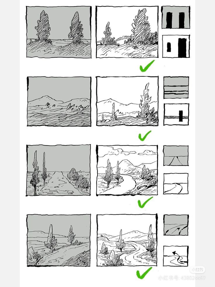
Example 1: The Centered Vertical Dominance (Poor Composition – Avoid This)
This first example illustrates a classic beginner error: over-reliance on symmetry and a dominant central element without supporting structure.
- Shaded Rendering: The scene depicts two tall, conical trees standing prominently in the center against a flat horizon line. The background is a uniform gray sky and ground, with minimal variation in tone. This creates a static feel, as if the trees are isolated pillars with no invitation to explore the space.
- Line Drawing: Simplifying to outlines, we see a gentle hill curving slightly, topped by a single tree (perhaps a merged view of the two). The lines are straightforward but lack directionality, resulting in a composition that feels anchored in the middle without flow.
- Thumbnail Abstract: Reduced to its essence, this becomes a thin, vertical black bar against a white field—resembling a door or window frame. This shape is too simplistic and symmetrical, offering no visual intrigue or movement. It fails to engage because it doesn’t suggest depth or narrative; the eye hits the bar and stops.
Why It’s Poor: This setup violates asymmetry and flow principles, leading to a “bullseye” effect where the center dominates without purpose. No checkmark here signals it’s not recommended. Tutorial Tip: To fix this, offset the trees to one side (e.g., using the rule of thirds) and add a secondary element like a path or distant hill to balance the weight. Practice by sketching variations: Move the trees left, add foliage on the right, and re-thumbnail to check for improved dynamics.
Example 2: Layered Horizontal Masses (Strong Composition – Recommended)
Shifting to a more balanced approach, this example demonstrates how horizontal layering can create stability while incorporating subtle vertical accents for interest.
- Shaded Rendering: A serene landscape with rolling hills or mountains in the background, shaded in mid-tones to suggest distance. The foreground includes sparse vegetation or rocks, with a gradual transition from dark to light values, evoking atmospheric perspective.
- Line Drawing: Outlines reveal a series of undulating horizons—multiple layers of hills stacking like steps. A single tree or bush punctuates the midground, adding a vertical counterpoint to the dominant horizontals without overwhelming them.
- Thumbnail Abstract: This distills to stacked horizontal bars of varying thickness, with a small black vertical notch (representing the tree). The result is a banded structure, like sedimentary layers, which provides rhythm and depth without complexity.
Why It’s Strong: The layered design creates a sense of receding space, inviting the viewer to “climb” through the scene. The checkmark affirms its effectiveness, as it achieves balance through repetition and contrast. Tutorial Tip: Apply this in your work by starting with broad horizontal zones (sky, midground, foreground) and adding one or two vertical elements for focal interest. Experiment with value: Darken the foreground bar for grounding, lighten distant ones for haze. Draw 5-10 thumbnails varying the layer counts to find the most harmonious arrangement—ideal for serene, expansive vistas like prairies or seascapes.
Example 3: Triangular Convergence (Dynamic Composition – Recommended)
Here, we explore a pointed, directional structure that builds tension and guides the eye to a climax, perfect for dramatic landscapes.
- Shaded Rendering: A mountainous scene with a central peak rising sharply, flanked by lower hills and trees in the foreground. Shading emphasizes the convergence toward the top, with darker tones at the base fading upward, enhancing the sense of height and majesty.
- Line Drawing: Clean lines show bushes or trees leading toward a winding path that ascends to the peak. The overall form tapers like an arrowhead, with diagonal lines reinforcing the upward pull.
- Thumbnail Abstract: Simplified to a bold black triangle, widest at the base and pointed at the top. This shape symbolizes stability (broad foundation) while directing attention focal-ward, like a visual pyramid.
Why It’s Dynamic: Triangular compositions create energy and focus, mimicking natural forms like mountain ranges. The checkmark highlights its success in avoiding flatness by using diagonals for movement. Tutorial Tip: Use this for subjects with natural peaks, such as alps or volcanoes. Sketch the triangle first as your armature, then fit elements within it—place the apex off-center for asymmetry. Add converging lines (e.g., a river or fence) to amplify direction. Practice tonal gradients: Dark base for weight, light tip for distance. Create variations by tilting the triangle or combining with curves for hybrid designs.
Example 4: Meandering Curve (Fluid Composition – Recommended)
Our final example introduces organic flow, ideal for narrative-driven landscapes that evoke exploration.
- Shaded Rendering: A winding road or river snakes through the scene, starting in the foreground and curving into distant hills with scattered trees. Shading builds depth, with bolder tones near the viewer fading to grays in the background.
- Line Drawing: Fluid, curving lines dominate, showing the path meandering past bushes and toward a vanishing point. Trees are placed along the curve to reinforce the rhythm, creating a gentle S-shape overall.
- Thumbnail Abstract: Reduced to a sinuous black line arcing across the frame, like a river bend with an arrowhead at the end. This captures motion and continuity without rigid geometry.
Why It’s Fluid: The curving path leads the eye on a journey, building curiosity and depth. The checkmark endorses it for its natural, engaging quality, contrasting static designs. Tutorial Tip: Perfect for rural roads or streams; start by drawing the curve as your primary line, then add supporting elements along it. Ensure the curve enters from one corner and exits another to avoid closure. Vary thickness for emphasis (thicker foreground for proximity). Thumbnail multiple curves (S, C, or zigzag) and test with value fills to ensure smooth transitions—great for adding storytelling to your art.
Conclusion: Applying These Principles to Your Artwork
By studying these examples, you can see how a strong landscape composition hinges on an intriguing underlying abstract. Poor ones (like the first) feel monotonous, while effective ones (marked with checks) offer balance, direction, and intrigue. To integrate this into your practice:
- Always begin with thumbnails—sketch 3-5 abstracts before committing to a full drawing.
- Critique using questions: Does it have flow? Is there asymmetry? Does the eye move naturally?
- Experiment with hybrids: Combine a triangle with a curve for complex scenes.
- Reference art history: Study Payne’s “Composition of Outdoor Painting” or Japanese notan exercises for deeper insights.
- Iterate: Redraw weak compositions until the thumbnail excites you.
With consistent application, your landscapes will evolve from flat sketches to immersive worlds. Share your before-and-after thumbnails in the comments below, and happy drawing! For more tutorials, subscribe to our art blog.