Mastering Facial Proportions with the Loomis Method: A Detailed Tutorial for Drawing Realistic Human Heads from Multiple Angles

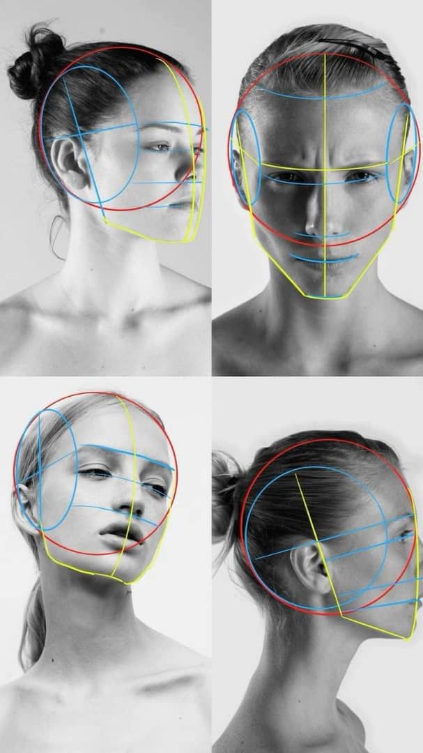
In the realm of portrait drawing and character design, understanding facial proportions is essential for creating lifelike and expressive faces. This comprehensive tutorial draws inspiration from a reference image featuring four black-and-white photographs of a female model, overlaid with colorful construction lines in red, blue, and yellow. These overlays illustrate the classic Loomis method—a time-tested technique developed by artist Andrew Loomis—for breaking down the human head into geometric shapes, ensuring accurate alignment of features regardless of angle or expression. The image is divided into a 2×2 grid: top-left shows a three-quarter side view with a neutral expression; top-right depicts a front view with a furrowed brow and intense gaze; bottom-left captures an upward tilt with eyes looking forward; and bottom-right presents a profile view with a slight downward gaze. Each view highlights the cranium as a sphere, facial planes as intersecting lines, and key landmarks like the brow, nose, and chin.
This guide is perfect for beginner to intermediate artists working in pencil, charcoal, or digital media such as Clip Studio Paint or Adobe Photoshop. We’ll break it down step by step, referencing each quadrant of the image, with tips on avoiding common pitfalls, practical exercises, and variations for different face types (e.g., masculine, youthful, or diverse ethnicities). By following along, you’ll learn to construct heads that maintain harmony in proportions, leading to more dynamic and believable artwork. Remember, the Loomis method emphasizes the head as a three-dimensional form: a sphere for the cranium (about two-thirds of the total head volume) attached to a wedge-shaped face plane, with guidelines dividing it into equal thirds for features.
Section 1: Understanding the Basics of the Loomis Method (Overview of the Reference Image)
The Loomis method simplifies the complex anatomy of the head by starting with a circle for the cranium and adding cross-lines for orientation. In the reference image, red lines often denote the outer contours and jawline, blue lines mark horizontal divisions (e.g., eye level), and yellow lines indicate vertical centerlines or chin alignments. The model’s hair is tied in a bun, minimizing distractions and focusing on bone structure, while the grayscale photography emphasizes form through light and shadow.
- Core Construction Elements: Every head begins with a circle representing the skull’s dome. Slice off the sides to form the temporal lines (visible as curved blue or red arcs in all views). Add a centerline (yellow vertical line) for symmetry and a horizontal brow line (blue) at the midpoint of the circle. The face extends downward from this, with the nose base at the next third and chin at the bottom.
- Color Coding for Clarity: Red circles outline the cranium’s sphere; blue horizontals divide features (eyes on the top blue line, mouth on the lower); yellow connects jaw and chin for rhythm. This coding helps visualize foreshortening in rotated views.
- Application Tip: Scan or import the reference image into your drawing software. Trace the lines lightly to internalize the method, then erase and redraw from memory. Common error: Treating the head as flat—always think in 3D, rotating mentally like a ball.
This foundational approach ensures consistency across poses, as seen in the image’s varied angles.
Section 2: Breaking Down the Three-Quarter Side View (Top-Left Quadrant)
The top-left photo shows the model in a subtle three-quarter turn, head slightly tilted upward, with a relaxed expression. Overlays include a large red circle for the cranium, blue ovals for cheek contours, and yellow lines tracing the jaw.
- Step-by-Step Construction: Start with the cranium circle, tilted to match the pose. Draw the centerline curving with the turn, then add the brow line perpendicular to it. Position eyes along the brow line, spaced one eye-width apart (the overlay shows blue arcs for eye sockets). The nose drops from the brow’s center, ending at the next horizontal third, while the mouth sits two-thirds down from the nose base.
- Incorporating the Neck and Shoulders: The neck is implied as a cylinder attaching at the cranium’s base, with light shading suggesting trapezius muscles. Align the ear between brow and nose lines in side views.
- Practical Exercise: Draw 5 variations of this angle, altering the tilt by 5-10 degrees each time. Use a mirror for self-reference. Avoid mistake: Misaligning features in perspective—use vanishing points if needed for accuracy.
This view is ideal for practicing subtle rotations, common in portrait commissions.
Section 3: Front View with Expression (Top-Right Quadrant)
Here, the model faces forward with furrowed brows and a stern expression, emphasizing how proportions hold even under emotional distortion. Overlays feature a central yellow vertical line, blue horizontals for features, and red circles wrapping the head.
- Building the Frontal Structure: Divide the circle into halves with the blue brow line. Eyes sit on this line, with the inner corners aligning to the nose’s width. The red jawline angles inward from the circle’s sides, creating a tapered oval. Yellow lines underscore the mouth and chin for balance.
- Handling Expressions: Wrinkles and shadows (as in the furrowed brow) don’t alter base proportions but add volume. Adjust the blue mouth line slightly downward for a frown, keeping it parallel to the eyes.
- Shading and Refinement: Use cross-hatching to build form, as hinted by the photo’s tonal gradients. Tip: For digital artists, use symmetry tools initially, then break it for natural asymmetry. Error to watch: Over-widening the face—measure against the cranium circle.
Master this for expressive characters in comics or illustrations.
Section 4: Upward Tilt Perspective (Bottom-Left Quadrant)
The bottom-left captures an extreme upward view, foreshortening the lower face while expanding the forehead. Red and blue lines curve dramatically to show compression.
- Foreshortening Techniques: Tilt the cranium circle backward, shortening vertical distances. The yellow centerline curves upward, with blue feature lines bunching at the bottom. Eyes appear larger and closer together; chin recedes.
- Anatomical Details: Neck stretches, revealing the Adam’s apple area. Overlays use red for the undershot jaw, blue for compressed lips.
- Exercise for Mastery: Sketch from low-angle photos of yourself or models. Gradually increase tilt. Common pitfall: Ignoring curve in guidelines—straight lines will flatten the form.
This angle adds drama, useful in storytelling art like fantasy portraits.
Section 5: Profile View Analysis (Bottom-Right Quadrant)
The final quadrant is a clean side profile, head neutral with a slight forward lean. Lines include red cranium circle, blue facial plane, and yellow jaw contour.
- Profile Construction: The cranium circle protrudes back, with the face as a flat plane at 90 degrees. Blue lines mark eye level (ear aligns here), nose base, and mouth. Yellow traces the elegant S-curve from forehead to chin.
- Proportional Ratios: Head depth equals height; ear sits midway. Red overlays show muzzle area (nose/mouth) as a smaller circle.
- Advanced Variations: Adapt for different ages—shorten lower face for children. Practice by rotating to 45 degrees. Tip: Use plumb lines for alignment.
Additional Professional Tips and Resources
- Tools Recommendations: Graphite pencils (2H for lines, 4B for shading) on smooth paper; digitally, brushes with pressure sensitivity.
- Variations for Diversity: Adjust circle elongation for longer faces (e.g., Asian features as in the model) or broaden for masculine structures.
- Common Challenges: Proportions shift with age/ethnicity—study references like Loomis’ “Drawing the Head and Hands” book.
- Daily Practice: Spend 20 minutes quick-sketching heads using this method. Critique by overlaying your drawing on the reference.
This tutorial equips you with the skills to tackle any head pose confidently. Experiment, iterate, and soon you’ll draw from imagination with precision. For more advanced topics like adding hair or lighting, explore related guides on our site. Share your progress in the comments!