Painting Mood Using Color and Lighting
Color and lighting are powerful tools to evoke emotion, tell stories, and set the atmosphere in your artwork. Warm colors and soft, golden lighting create comfort and energy, while cool tones with dramatic shadows build mystery, calm, or melancholy. Mastering these can instantly elevate your paintings from flat to emotionally resonant. Here are key tips to paint mood effectively.
1. Warm Colors + Soft Lighting = Cozy, Inviting, Joyful Moods
Use reds, oranges, yellows, and earthy tones with gentle, diffused light (like golden hour sun or candlelight) to convey warmth, happiness, or intimacy. These make viewers feel welcomed and energized.


Think cozy interiors or vibrant sunsets—perfect for uplifting scenes.
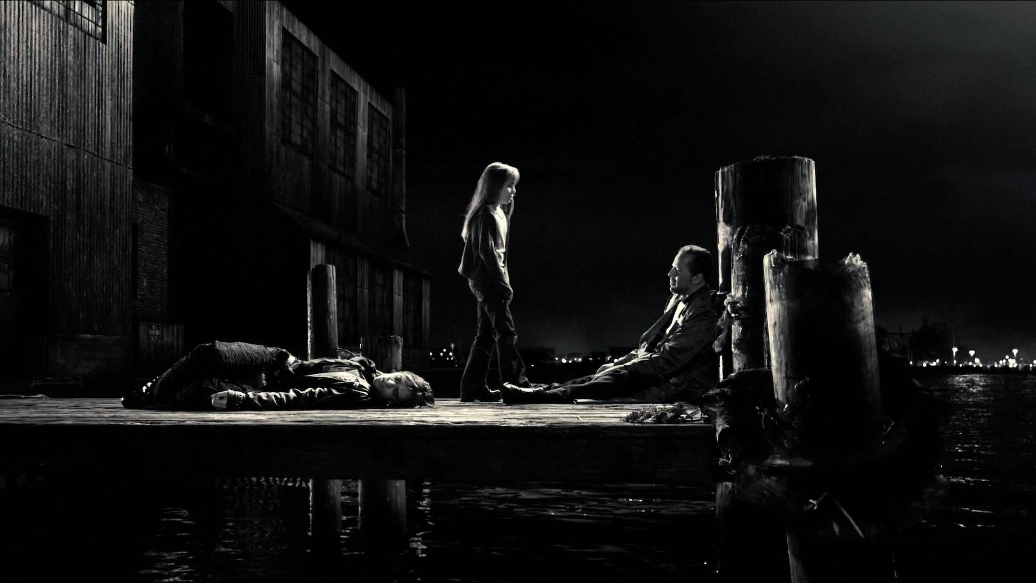
2. Cool Colors + Low-Key Lighting = Calm, Mysterious, or Melancholy Moods
Blues, greens, purples, and deep shadows with moonlight or dim sources create serenity, sadness, introspection, or eeriness. High contrast adds drama.

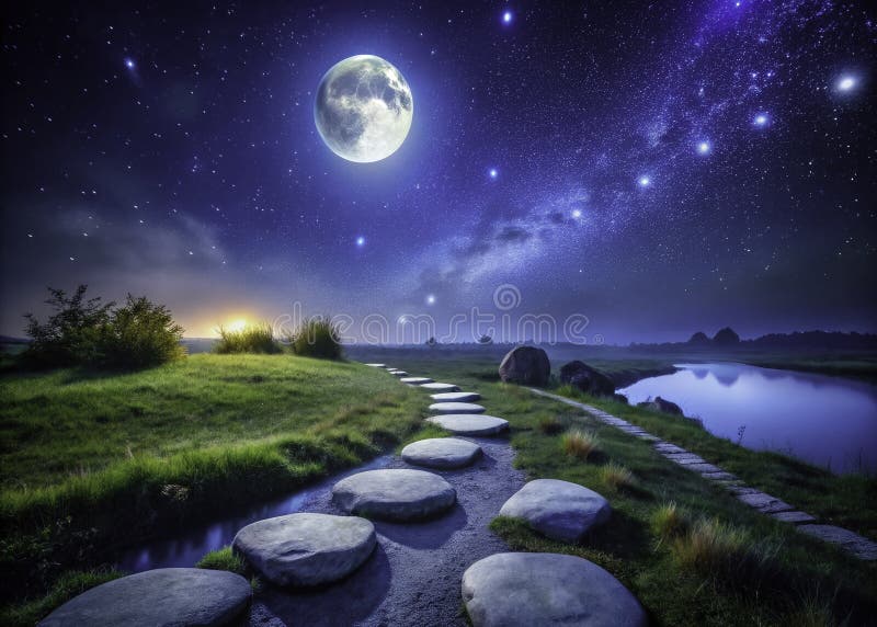


Moonlit landscapes or foggy nights excel here—great for emotional depth.
3. Chiaroscuro (Strong Light-Dark Contrast) = Dramatic, Tense, or Mysterious Moods
Use extreme value differences—one strong light source against deep shadows—for intensity, like Rembrandt’s style. It heightens emotion and focuses attention.
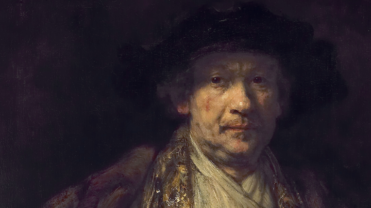

This technique builds suspense and draws the eye to highlights.
4. Muted, Desaturated Colors = Somber, Reflective, or Sad Moods
Lower saturation with grays, muted blues, and earth tones plus soft or side lighting evokes loneliness, nostalgia, or quiet emotion.


Ideal for introspective portraits or rainy scenes.
5. Bright, Saturated Colors + Dynamic Lighting = Energetic, Playful, or Exciting Moods
Vivid hues (pinks, yellows, turquoises) with bold, colorful lights create joy, vibrancy, and fun—think pop art or explosive abstracts.


Great for celebratory or high-energy pieces.
Pro Tips for Success
- Start with a limited palette (3-5 colors) to control mood consistency.
- Use color temperature: Warm lights advance (feel closer), cool recede.
- Lighting direction matters—side/back lighting adds depth and drama; front lighting flattens for calm.
- Test moods with quick thumbnails before committing.
Video Recommendations to watch these in action:
- “How to Create Mood in your Art” (acrylic landscape demo with color & light tips) → https://www.youtube.com/watch?v=HVwCDV7tzyA
- “The Secret to Painting Light: Mastering Values with Color” → https://www.youtube.com/watch?v=Wo1Dd3QA-48
- “LEARN HOW TO PAINT MOOD AND ATMOSPHERE” (ambient light tutorial) → https://www.youtube.com/watch?v=t53nJn5RLvg
- “Transform your paintings with color temperature | Color theory tutorial” → https://www.youtube.com/watch?v=SpbpHotC-i0
- “How Artists Use Color to Create Mood | Color Theory for Atmosphere & Emotion” → https://www.youtube.com/watch?v=PXLwLOFmK7M
Experiment with one mood per painting—warm cozy vs. cool mysterious—and you’ll see huge progress. Which mood are you painting next? Drop your results if you want thoughts! 🎨✨