Mastering Fist & Punch Rendering in Digital Art: Brush Settings, Smear vs. Clean Lines, and Shading Techniques Tutorial

In dynamic anime, manga, and action-oriented digital illustrations, clenched fists and powerful punches are iconic elements that convey energy, impact, and character emotion. However, rendering them convincingly requires careful control over line weight, brush dynamics, shading, and texture—especially when deciding between clean, crisp lines for a polished look versus smear/textured strokes for raw intensity and motion.
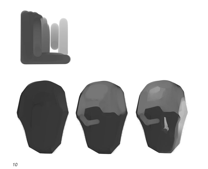
The reference sketch above provides an excellent side-by-side comparison of brush techniques applied to a bandaged fist (common in fighting/shonen styles). It demonstrates how varying brush size, opacity, flow, and stroke style dramatically affect the final feel of the form—from smooth spherical shading to aggressive, jagged outlines and textured fills. This tutorial breaks it down step by step, explaining each example in the image and how to replicate these effects in popular apps like Clip Studio Paint, ibisPaint X, Krita, or Procreate.
Key Concepts Covered
- Form basics: Treating the fist as a simplified sphere + cylinder combo for believable volume.
- Brush decision-making: When to use hard round brushes (clean), textured/scattering brushes (smear/grunge), or custom textured stamps.
- Line quality: Thin/even vs. thick/varying pressure for dynamic energy.
- Shading approaches: Soft gradients for realism vs. stylized hatching/cross-hatching for manga/anime speed.
- Common pitfalls: Over-smearing (loses form), too uniform lines (looks stiff), ignoring gesture (flat impact).
Step-by-Step Breakdown & Tutorial (Matching the Image Examples)
- No Smear – Clean Spherical Shading (Top Reference) A simple blue sphere next to a clean-lined fist with red bandages.
- Goal: Smooth, volumetric form with soft gradients.
- Brush settings: Hard round brush, size 10–20, 100% opacity, low flow or pressure sensitivity off for even tone.
- Technique:
- Draw clean outline of fist (wrist wrap, knuckles, thumb).
- Block in base skin tone on a new layer (clipped to lineart).
- Add soft sphere shading: light source from upper left → highlight on top knuckles, core shadow under fingers/wrist, reflected light on underside.
- Blend gently with soft airbrush or finger tool for smooth transition.
- Best for: Heroic, polished moments or realistic rendering.
- Pro tip: Keep edges crisp where planes change (knuckle ridges) for structure.
Here are examples of clean, volumetric fist shading in digital art:
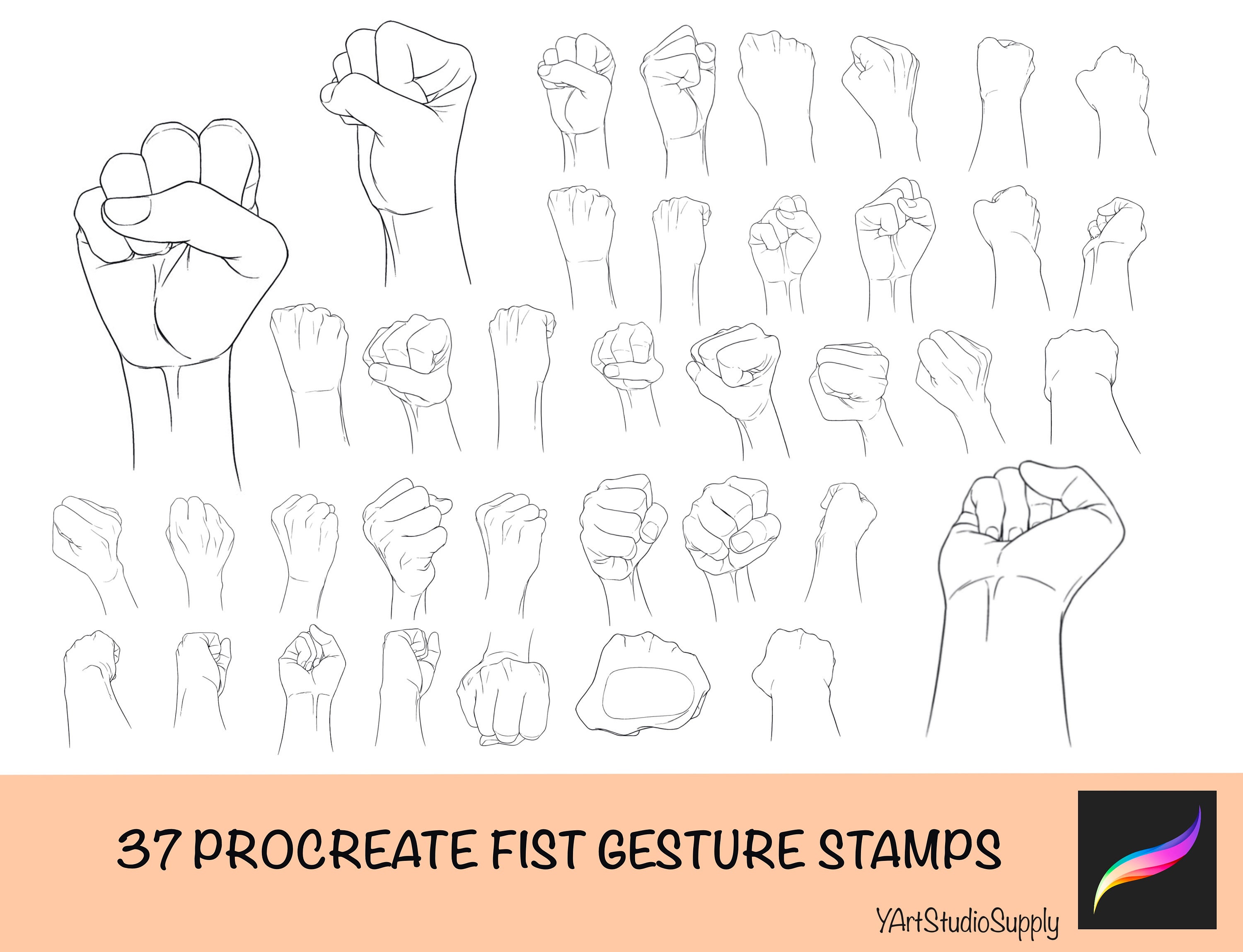
- Light Smear/Texture – Brush Size 1.5–15 (Middle Rows) Progressively rougher fists with increasing jagged edges and speckled shading.
- Goal: Add grit and energy without losing form.
- Brush settings:
- Thin textured brush (size 1.5–5): jagged edges like charcoal or dry media.
- Medium round brush (size 10–15): slight scattering or grain for fill.
- Technique:
- Rough lineart with pressure-sensitive brush for natural variation.
- Shade with short, choppy strokes following form (circular on sphere, angular on planes).
- Use low opacity buildup (20–40%) to layer texture.
- Add subtle noise/grain filter or textured brush for skin-like roughness on bandages.
- Best for: Action scenes, training arcs, or gritty shonen style.
- Heavy Smear & Aggressive Texture – Brush Size 100, “X” Crosshatch (Lower Rows) Very rough, scratched-looking fist with heavy cross-hatching and “X” marks.
- Goal: Maximum impact and motion blur feel.
- Brush settings: Large textured brush (size 80–100), low opacity, high scattering or “even throughout” mode; custom crosshatch stamp or dense hatching brush.
- Technique:
- Loose, energetic lineart with varying thickness.
- Block shadows aggressively with large, overlapping strokes.
- Use “X” or crisscross hatching for dark areas (knuckle shadows, under fist).
- Thin out edges with eraser or thin brush (size 1.0) for crisp highlights.
- Optional: Add motion lines or speed streaks radiating from fist.
- Best for: Impact frames, punch SFX moments, high-energy sequences.
Brush stroke comparison examples showing clean vs. textured digital shading:
Advanced Tips for Fist Rendering
- Gesture first: Sketch the punch pose loosely before refining—focus on tension in forearm, wrist angle, and thumb placement.
- Bandage texture: Use repeating wrap patterns + subtle folds; add dirt/grime with textured brushes for realism.
- Lighting consistency: Always define one main light source; add rim light on fist edges for pop.
- Brush customization (Clip Studio recommended):
- For smear: Increase “Texture” density + “Anti-aliasing” off.
- For clean: “Density” high, “Stabilization” on.
- Experiment with “G-pen” or “Real pencil” bases.
- Practice exercise: Draw the same fist 5 times using each style in the image—compare which conveys the most power.
Mastering these brush and shading variations will level up your action poses dramatically. Whether you’re going for sleek heroism or brutal intensity, the right technique makes all the difference.
Try recreating one of these fists in your app of choice—what style do you prefer: clean and smooth or rough and energetic? Share your results or brush settings in the comments!