Composition Tips That Instantly Improve Art
Composition is the foundation of great artwork—it’s how you arrange elements to guide the viewer’s eye, create balance, and evoke emotion. Even small tweaks using proven techniques can transform a flat piece into something dynamic and professional. Here are some of the most powerful composition tips that deliver instant improvements, no matter your medium (digital, traditional, painting, drawing, etc.).
1. Rule of Thirds – The Go-To for Instant Balance
Divide your canvas into a 3×3 grid (two horizontal and two vertical lines). Place key elements along these lines or at their intersections instead of dead center. This creates natural tension and interest.
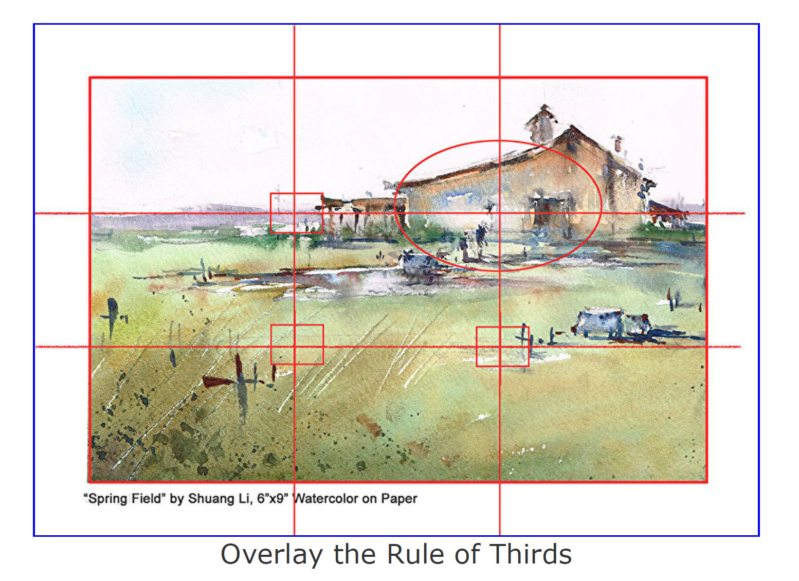

The eye naturally gravitates to these “power points,” making your subject feel more engaging.
2. Leading Lines – Guide the Viewer’s Eye Like a Pro
Use lines (roads, rivers, arms, edges, shadows) to direct attention toward your focal point. They add depth and movement.
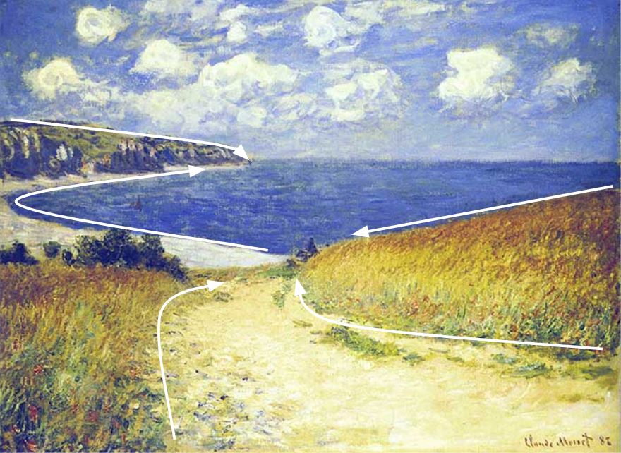
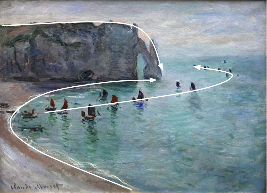
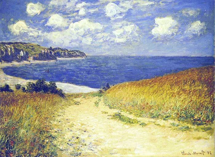
In Monet’s works, curved paths pull you right into the scene—try this in your next landscape or portrait!
3. Golden Ratio (Fibonacci Spiral) – For Organic, Masterful Harmony
This ratio (~1:1.618) appears in nature and classics like the Mona Lisa. Overlay a spiral or grid to place elements along the curve for a more natural flow than strict thirds.

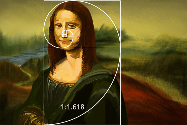

It’s subtler and feels more “alive”—perfect for portraits or complex scenes.
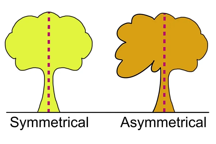
4. Balance – Symmetrical vs. Asymmetrical
Symmetrical balance feels calm and formal (mirror-like). Asymmetrical uses unequal elements but equal visual weight (via color, size, contrast) for dynamic energy.
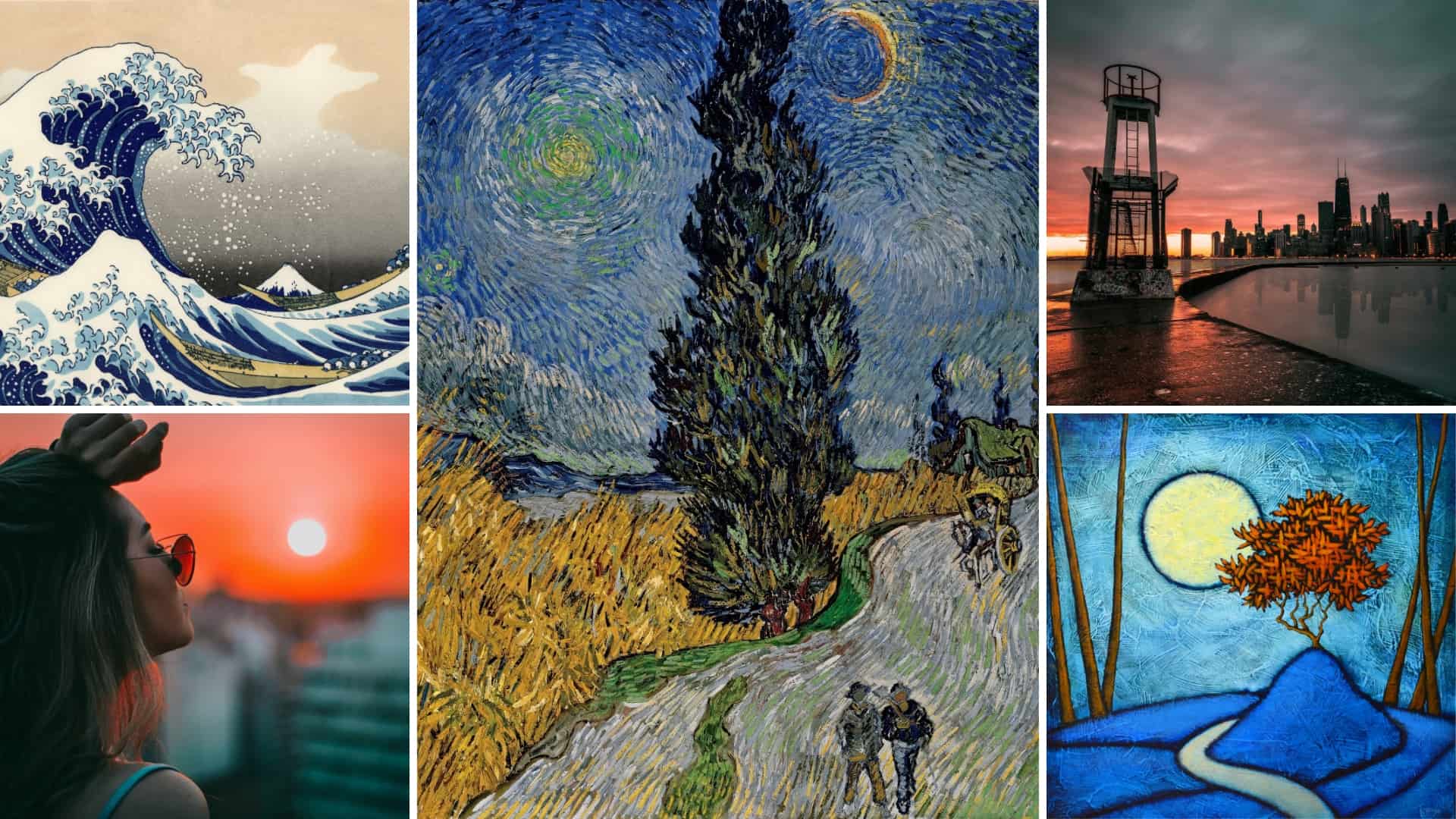
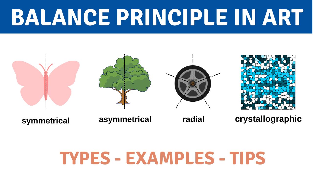
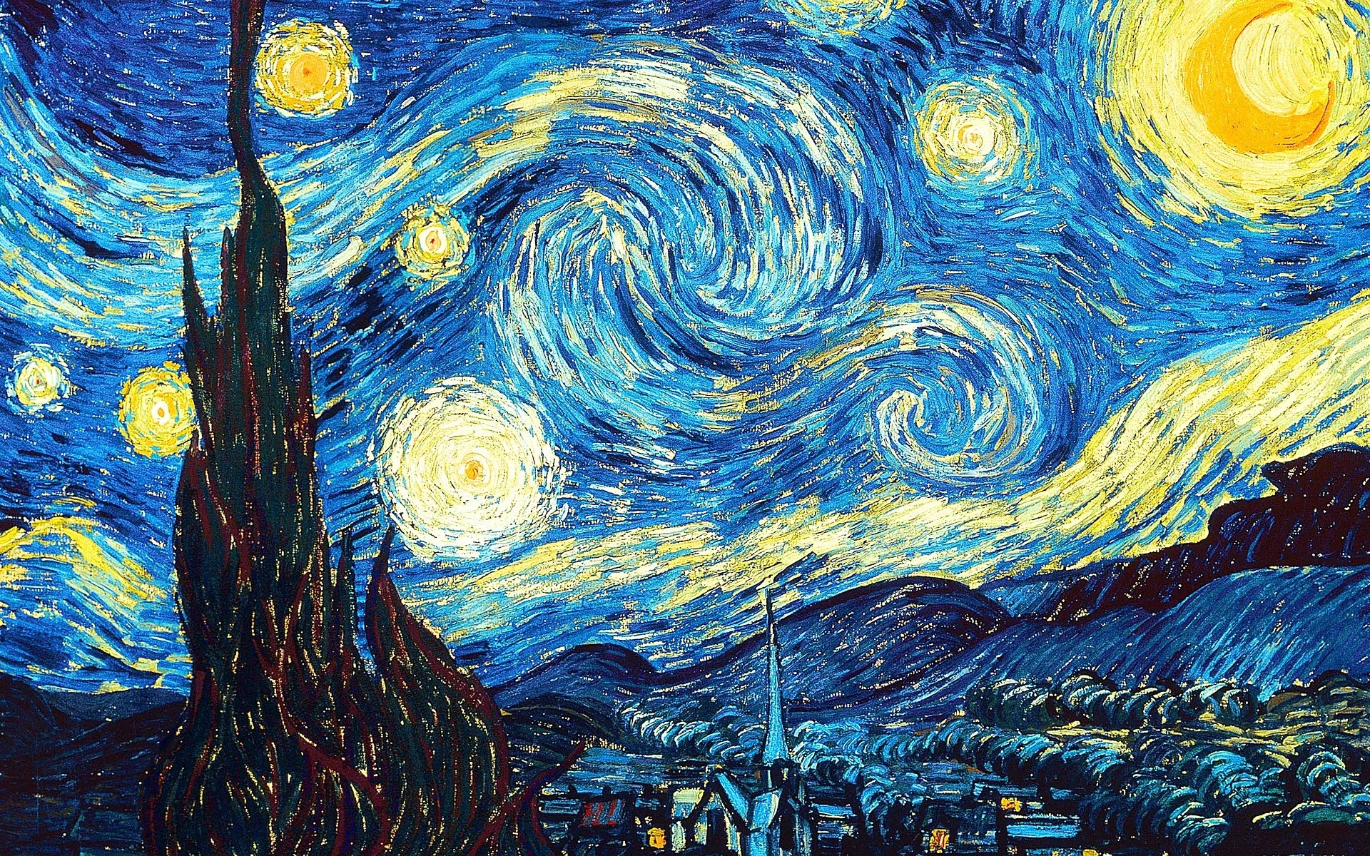
Van Gogh’s Starry Night uses asymmetrical balance masterfully—the swirling sky pulls against the dark cypress.
5. Create a Strong Focal Point (Emphasis)
Make one area stand out with contrast, isolation, detail, or color. Everything else supports it.


The bright moon or a single vivid flower in a field draws the eye immediately.
6. Negative Space – Let Breathing Room Work Magic
Don’t fill every inch—use empty space to emphasize your subject and create elegance.


Minimalist pieces feel powerful and modern.
7. Framing – Add Depth and Focus
Use natural elements (windows, arches, trees) to frame your subject, drawing attention inward.


It adds layers and tells a story.
Quick Video Recommendations to see these in action (great for visual learners):
- “Compositional Painting: Golden Ratio, Rule of Thirds & Harmonic Armature” → https://www.youtube.com/watch?v=VHHeL9myDak (breaks down classics with overlays)
- “Staging & Composition Tutorial (rule of thirds, golden ratio, leading lines)” → https://www.youtube.com/watch?v=ywT70S5ox-g (painting-focused walkthrough)
- “How to Use the Rule of Thirds to Improve Your Compositions” → https://www.youtube.com/watch?v=OSHtvWeddTI (practical artist examples)
Apply one tip per piece next time you create—you’ll see massive improvements fast. Which one are you trying first? Share your before/afters if you want feedback! 🎨