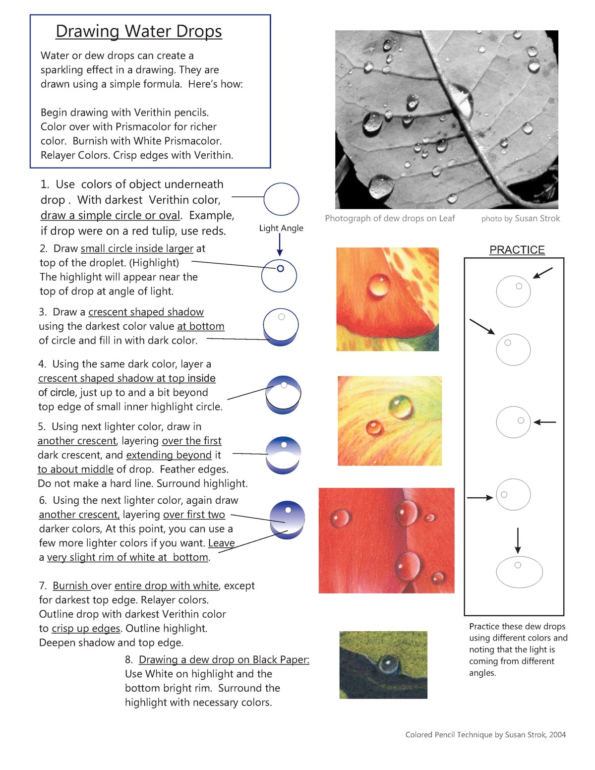
Mastering Realistic Water Drops: A Step-by-Step Colored Pencil Tutorial

Drawing water drops or dew droplets can transform an ordinary illustration into a captivating, sparkling masterpiece. These translucent elements capture light, reflection, and shadow in a way that adds depth and realism to your artwork, whether you’re depicting morning dew on a leaf, raindrops on a window, or condensation on a glass surface. In this comprehensive tutorial, inspired by time-tested colored pencil techniques, we’ll break down the process into a simple, repeatable formula. This method, originally popularized by artists like Susan Strok in her 2004 guide Colored Pencil Technique, relies on layering colors strategically to mimic the optical properties of water—its refraction, highlights, and subtle shadows.
Whether you’re a beginner artist looking to build foundational skills or an experienced illustrator seeking to refine your rendering of transparent objects, this guide will equip you with the tools and insights needed. We’ll use Prismacolor pencils for their vibrant pigmentation and blendability, Verithin pencils for crisp edges and details, and white for burnishing to achieve that glossy sheen. The key is patience: build layers gradually to avoid muddying colors, and always work from light to dark (or in this case, strategically placing darks first for contrast).
Materials You’ll Need
Before diving in, gather these essentials for optimal results:
- Prismacolor Pencils: For rich, blendable color layering. Key shades include those matching the surface beneath the drop (e.g., reds for a tulip petal, greens for a leaf).
- Verithin Pencils: Thinner, harder leads for precise outlines and sharp edges. Use the darkest shades in your palette for initial structuring.
- White Prismacolor Pencil: Essential for burnishing and creating highlights.
- Paper: Smooth, heavyweight paper like Bristol board or hot-pressed watercolor paper to handle multiple layers without buckling. For dramatic effects, try black paper.
- Blending Tools: A colorless blender pencil or tortillon for smoothing (optional, but recommended for seamless transitions).
- Eraser: A kneaded eraser for lifting highlights if needed.
- Reference Photo: Use a high-quality image, like a close-up of dew on a leaf, to study light angles and reflections.
Pro Tip: Work in a well-lit environment with natural light to accurately judge color values and highlights. Always sharpen your pencils frequently for fine control.
Understanding the Science Behind the Sparkle
Water drops act like tiny lenses, bending light (refraction) and creating bright highlights where light enters and dark shadows where it exits or is blocked. The “sparkling effect” comes from high contrast: intense whites against deep shadows, with subtle gradients in between. The formula we’re using simplifies this into shapes—a circle or oval base, internal highlights, and crescent shadows—to replicate realism without overcomplicating the process.
Observe real water drops: The highlight is typically at the top (where light hits directly), shadows curve at the bottom, and the drop reflects the colors of its underlying surface. If the drop is on a colored object, those hues will show through, distorted slightly for authenticity.
Step-by-Step Tutorial: Drawing a Basic Water Drop
Follow these steps sequentially, allowing each layer to set before proceeding. Practice on scrap paper first, noting how light angles change the drop’s appearance.
- Establish the Base Shape with Underlying Colors
Start by lightly sketching the outline of your water drop as a simple circle or oval, depending on the viewing angle (e.g., more oval for side views). Use the darkest Verithin pencil in the color of the object beneath the drop—for instance, a deep crimson if the drop is on a red tulip petal. This base layer represents the refracted colors visible through the water. Apply light pressure to fill the shape evenly, leaving no harsh lines. If the underlying surface has texture (like a leaf vein), subtly incorporate it here for added realism.
Example: For a dew drop on a green leaf, use Dark Green Verithin to draw the initial oval. - Add the Primary Highlight
Inside the larger circle, draw a small circle or oval near the top to represent the highlight—the point where light reflects most intensely. Leave this area completely white or very lightly shaded; it should appear as if light is bouncing off the drop’s surface. Position it slightly off-center based on your light source (e.g., upper left for light coming from that direction). This creates the illusion of volume and curvature.
Pro Tip: The highlight will appear larger and brighter in direct light; adjust size accordingly for softer, diffused lighting. - Introduce the Bottom Shadow Crescent
Using the same darkest color from Step 1, draw a crescent-shaped shadow at the bottom of the drop. This mimics the area where light is blocked or refracted away, casting a subtle shadow on the surface below. Fill it with the dark value, but feather the edges softly to avoid a hard line—water drops have soft transitions. Surround the highlight with this shadow for contrast, ensuring the crescent curves naturally along the drop’s contour.
Visual Cue: Think of it as a “smile” shape at the base, darker in the center and fading outward. - Layer a Top Inner Shadow Crescent
Still with your dark color, add another crescent shadow inside the top edge of the circle, just below the highlight. This should be slightly smaller and positioned right up to (but not overlapping) the highlight circle. Extend it a bit beyond the top edge for depth. This step enhances the three-dimensionality, suggesting the drop’s curvature and internal refraction.
Common Mistake to Avoid: Don’t make this too opaque; keep it translucent to let underlying colors peek through. - Build Mid-Tone Layers with Lighter Colors
Switch to the next lighter shade in your color family (e.g., from Dark Green to Medium Green). Draw another crescent over the existing dark ones at the bottom and top, extending beyond the first layer to about the middle of the drop. Feather the edges meticulously—use circular motions or hatching for smooth blending. This gradient creates the transition from shadow to light, mimicking how light diffuses through water. Do not create hard lines; instead, surround and soften the highlight.
Technique Insight: Layering lighter over darker builds luminosity; apply multiple thin coats for vibrancy. - Refine with Additional Lighter Layers
Now, use an even lighter color (e.g., Light Green) to add yet another crescent, overlapping the previous layers. Start from the dark crescents and work outward, covering more of the drop’s surface. At this stage, you can introduce subtle variations—if desired, add a few more progressively lighter shades for nuance. Leave a very slight rim of white at the bottom edge to suggest a reflective glow. This step polishes the translucency, making the drop appear wet and glistening.
Advanced Variation: For clustered drops, overlap shapes slightly and adjust shadows where they interact. - Burnish for Gloss and Final Touches
Burnish the entire drop with a white Prismacolor pencil, applying firm pressure to blend and polish the layers. Skip the darkest top edge to preserve contrast— this keeps the shadow crisp. Burnishing compresses the pigments, creating a shiny, glass-like finish. If needed, outline the drop with the darkest Verithin for crisp edges, then deepen shadows or top edges as a final adjustment.
Finishing Tip: On lighter paper, this creates a high-gloss effect; experiment with pressure for varying sheen levels.
Special Case: Drawing Dew Drops on Black Paper
For a striking contrast, like dew on a dark surface, reverse some elements: Use white pencil for the highlight at the top and a bright rim at the bottom. Surround the highlight with necessary colors from the underlying object, but keep the overall drop lighter to pop against the black. This technique emphasizes drama and is perfect for nocturnal scenes or abstract compositions.
Practice Exercises and Variations
- Basic Practice: Draw a series of drops on different colored backgrounds, noting how the light angle shifts the highlight (e.g., from top to side).
- Advanced Applications: Try drops from varying angles—overhead for perfect circles, angled for elongated ovals. Incorporate environmental reflections, like sky blue in a drop on a flower.
- Common Challenges and Solutions:
- Muddy Colors: Build layers slowly; clean your pencil tip between shades.
- Flat Appearance: Increase contrast by darkening shadows more aggressively.
- Uneven Blending: Use a blending stump for stubborn areas.
By mastering this formula, you’ll be able to add lifelike water elements to any piece, elevating your colored pencil art to professional levels. Practice consistently, and soon you’ll intuitively adapt it to rain, tears, or even abstract droplets. Share your creations in the comments below—what surface will you try first? For more tutorials, explore our guides on rendering glass or metallic surfaces. Happy drawing!