Color Mixing: How to Mix Any Color Using a Limited Palette
Color mixing is a fundamental skill in painting and art that allows you to create a vast array of hues, shades, and tones without needing dozens of premixed paints. By using a limited palette—typically just a handful of core colors—you can achieve harmonious results while simplifying your process and reducing costs. This approach is popular among artists working in oils, acrylics, watercolors, or gouache, as it encourages a deeper understanding of color theory. In this guide, we’ll explore how to mix any color you need, step by step.
Understanding a Limited Palette
A limited palette usually consists of the three primary colors—red, yellow, and blue—plus white for lightening and sometimes black for darkening. Common choices include:
- Cadmium Red (or a warm red like Alizarin Crimson)
- Cadmium Yellow (or a cool yellow like Lemon Yellow)
- Ultramarine Blue (or a warm blue like Phthalo Blue)
- Titanium White
- Optional: Ivory Black or Burnt Umber for neutrals
The key advantage is that limiting your options forces you to mix rather than rely on tubes, leading to more unified and vibrant artworks. Artists like the Impressionists often used limited palettes to capture light and atmosphere effectively.

This color wheel illustrates how primaries interact to form secondaries and tertiaries.
Basics of Color Theory for Mixing
To mix effectively, grasp these concepts:
- Hue: The pure color (e.g., red, green).
- Value: How light or dark the color is—add white to lighten (tints) or black to darken (shades).
- Saturation: Intensity—mix in the complementary color (opposite on the color wheel) to desaturate or gray it out.
Primaries mix to create secondaries:
- Red + Yellow = Orange
- Yellow + Blue = Green
- Blue + Red = Violet
Tertiaries come from uneven mixes, like more red in orange for a rusty tone. Always start with the lighter color and add darker ones gradually to avoid muddy results.
Step-by-Step Mixing Guide
1. Setting Up Your Palette
Arrange your colors in a logical order on a non-absorbent surface (like glass or plastic). Leave space for mixing. Use a palette knife for clean blends in oils or acrylics, or brushes for water-based media.
2. Mixing Neutrals and Grays
Neutrals are essential for realistic paintings. Mix complements: orange (red + yellow) + blue = brown or gray. Adjust with white for lighter values.
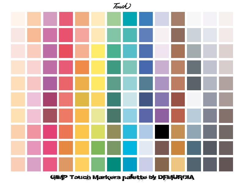
Here’s an example of a mixing chart showing various neutrals from a limited set.
3. Creating Earth Tones
For landscapes, mix burnt-like umbers by adding blue to orange. Vary ratios: more orange for warm browns, more blue for cooler ones.
4. Vibrant Colors and Adjustments
To get a bright green, use a cool yellow with a touch of blue. Dull it by adding red. For skin tones, start with white + yellow + red, then blue to neutralize.
Experiment by creating your own color charts: Paint swatches of mixes and label them for reference.
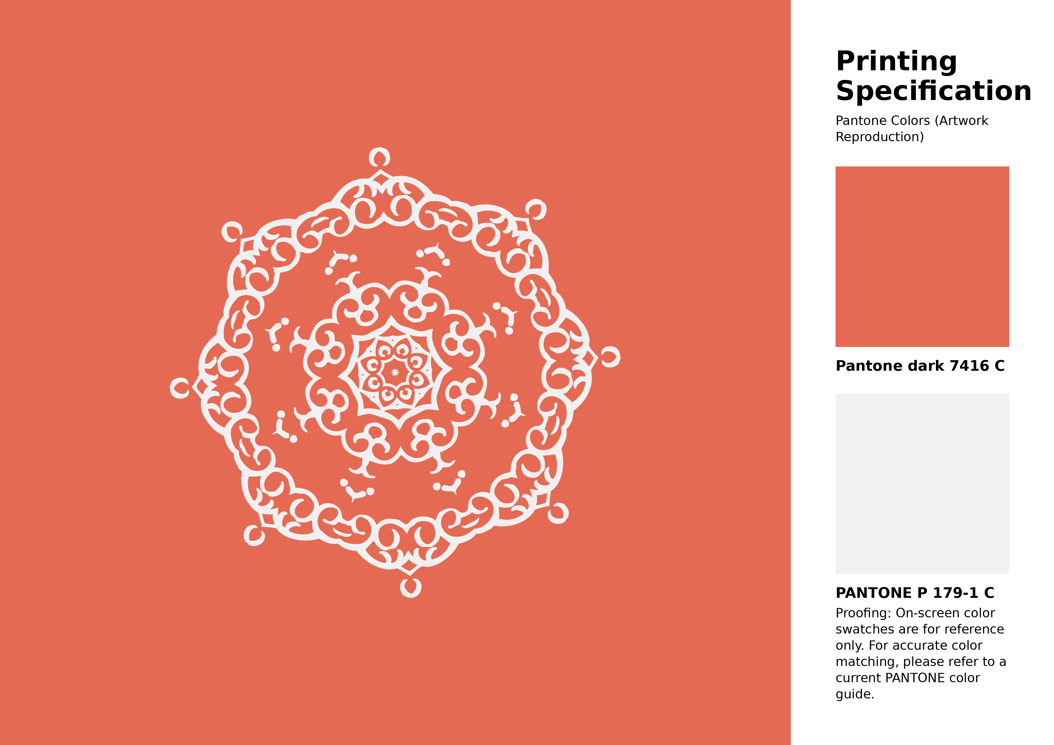
This palette example demonstrates vibrant mixes from basics.
5. Advanced Tips
- Temperature matters: Warm colors (reds, yellows) advance; cools (blues) recede.
- Avoid overmixing to prevent muddiness—mix on the canvas if possible.
- For watercolors, use transparent layers; for oils, build opacity.
- Test on scrap paper before applying.
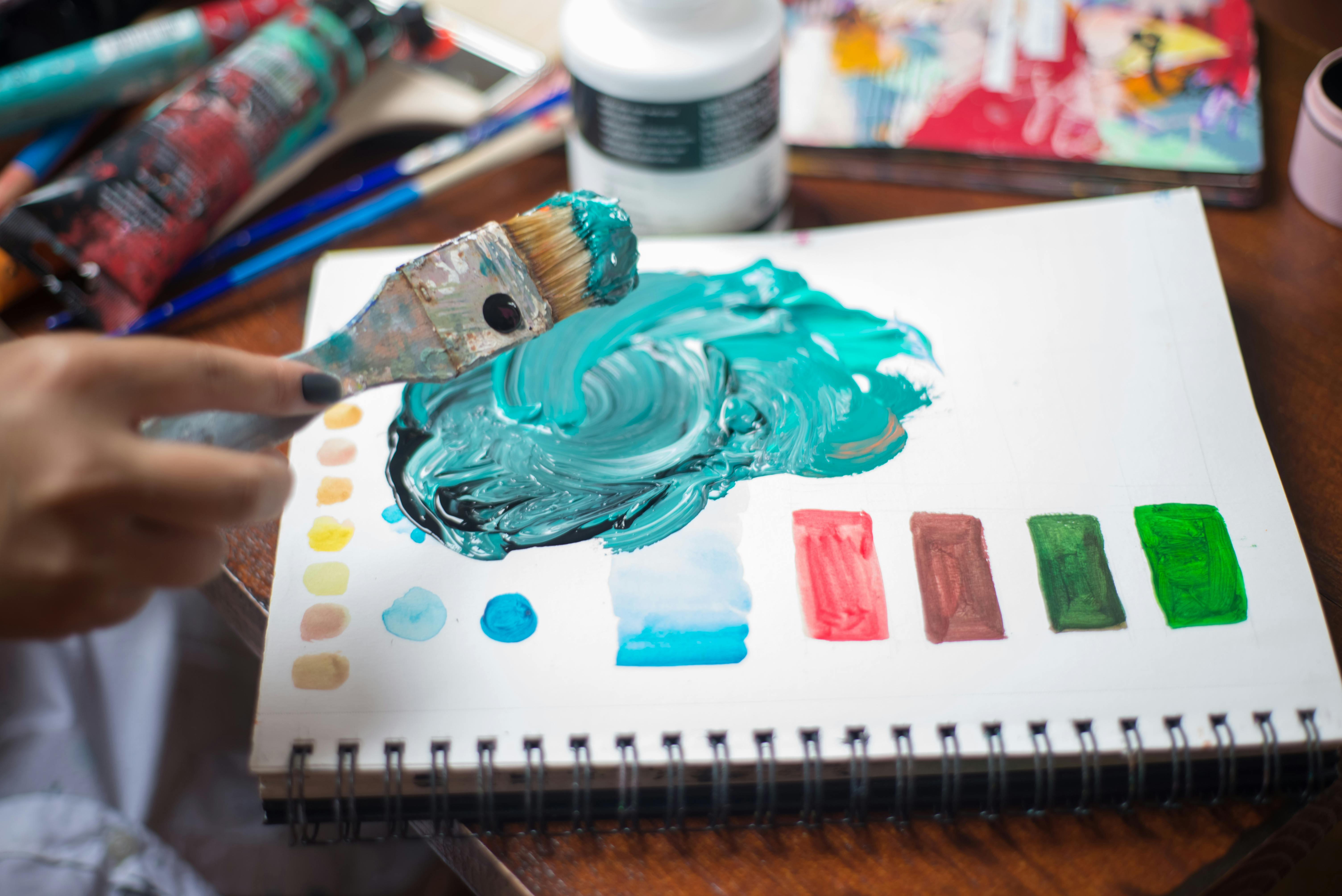
An artist mixing paints up close.
Video Tutorials for Visual Learning
To see these techniques in action, check out these helpful videos:
- Mix Any Colour With A Limited Palette – A demonstration showing practical mixing with primaries.
- How to Mix Any Color from a Limited Watercolor Palette – Focuses on charts for better understanding.
- GOAUCHE: How to Use a Limited Color Palette – Puts a limited palette to the test with various colors.
- Mixing harmonious colours using a limited palette – Starts with just 2-3 colors plus white.
- Color Mixing with a Limited Palette – Over 350 blends shown in detail.
A sample mixing chart for reference.
Practicing with a limited palette will transform your art, making colors more cohesive and your process more efficient. Start small, experiment, and soon you’ll mix any color intuitively!
