How to Draw Realistic Grasses and Wildflowers with Ink

A Beginner-Friendly Step-by-Step Tutorial Using Fineliner Pens
Adding lush, natural grasses and delicate wildflowers to your illustrations, landscapes, or sketchbook pages instantly brings life, texture, and depth to your artwork. Whether you’re drawing a meadow foreground, framing a character, enhancing a nature journal, or simply practicing organic line work, mastering simple yet convincing grasses and flowers is an essential skill for any ink artist.
This tutorial is based on a clean, expressive fineliner demonstration that shows both the “wrong” (overly stiff and uniform) and “right” (loose, varied, and natural) approaches — perfect for visual learners.
Tools Used in This Demo
- Sakura Pigma Micron pen (size 01 or 005 recommended for fine detail)
- Waterproof, fade-proof pigment ink (black)
- Smooth heavy-weight drawing paper or sketchbook (Bristol, hot-press watercolor paper, or any bleed-resistant surface works beautifully)
Core Principles for Natural-Looking Grasses & Wildflowers
Before picking up your pen, keep these key ideas in mind:
- Variety is everything — Nature never repeats the exact same shape, height, angle, or thickness.
- Randomness creates realism — Avoid symmetry, perfect spacing, and uniform direction.
- Layering builds depth — Work from background to foreground.
- Line weight variation adds life — Use both thin delicate strokes and slightly bolder ones.
- Negative space is your friend — Let areas of white paper “breathe” between clusters.
Step-by-Step Guide

Step 1: Establish the Ground Line
Lightly sketch (or imagine) a slightly wavy horizontal baseline where the grass meets the ground. This line can be broken or implied — it doesn’t need to be continuous.
Step 2: Create the Background Layer (Quiet, Distant Grasses)
- Use your finest nib (005 or 01).
- Draw very light, short, quick upward strokes — almost like tiny eyelashes.
- Keep these strokes mostly vertical or very gently leaning in different directions.
- Vary the height slightly (some short, some medium).
- Cluster them loosely — leave small gaps of white paper.
- This layer should feel soft and distant, almost like a haze of green.
Step 3: Add Midground Clumps & Texture
- Switch to slightly bolder pressure or a 01 nib.
- Draw taller, more varied grass blades:
- Some straight and proud
- Some gently curving
- Some leaning left, some right
- Introduce small clusters of 3–5 blades growing from the same base point.
- Add a few blades that cross over others (overlapping creates depth).
- Vary thickness: start thin at the base, taper to a sharp point at the tip.
Step 4: Introduce Wildflowers & Focal Interest
Now bring in flowers and seed heads for contrast and visual excitement.
Common easy wildflower shapes to practice:
- Daisy-like — simple circle + radiating petals
- Bell-shaped — small downward-facing cups
- Star-shaped — five or six pointed petals
- Spiky seed heads — tiny starbursts or pom-poms on thin stems
- Single-leaf accents — heart, oval, or lance-shaped leaves
Tips for flowers:
- Place them sparingly — 4–8 flowers across a wide patch feels natural.
- Vary height — some flowers tall and proud, others tucked low among grasses.
- Tilt flower heads in different directions (some face forward, some sideways, some downward).
- Add tiny dots, lines, or cross-hatching inside flower centers for texture.
Step 5: Final Layer — Foreground Details & Movement
- Use your boldest strokes here (slightly heavier pressure or a 03 nib if desired).
- Add a few very tall, sweeping grass blades that arc dramatically.
- Include seed heads, tiny buds, or curling tendrils.
- Scatter a few stray blades and leaves that break the top silhouette.
- Emphasize overlapping: let foreground grass cross over midground flowers and background clumps.
Step 6: Finishing Touches & Evaluation
Step back and ask yourself:
- Do I see clear foreground, midground, and background layers?
- Is there enough variety in height, angle, and density?
- Are there areas of rest (white space) balanced with areas of texture?
- Does it feel alive and organic rather than mechanical?
If it looks too uniform → add more random leaning blades and stray elements. If it feels too busy → erase or cover a few strokes to restore breathing room.

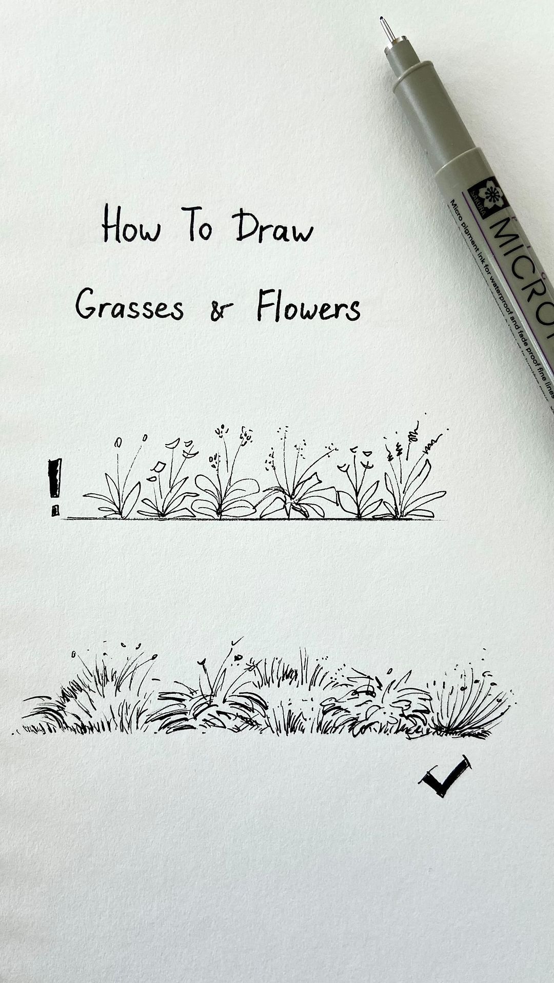
Quick Do’s and Don’ts (Visual Checklist)
Do This ✓
- Mix heights, angles, and densities wildly
- Overlap blades and let some cross
- Leave intentional gaps of white paper
- Vary line weight (light & delicate → bold & confident)
- Add a few “wild” sweeping blades for movement
Avoid This !
- Perfectly even spacing
- All blades the same height and thickness
- Every blade perfectly vertical
- Symmetrical clusters
- Covering the entire area (no breathing room)
Practice Prompts to Level Up
- Draw a single 6-inch strip of grass — focus only on variety.
- Add 5 different wildflower types in one patch.
- Draw the same patch at dawn (very light, sparse strokes) and dusk (darker, denser).
- Combine grasses with rocks, mushrooms, or a tiny path.
- Try the same scene in color (watercolor or markers) after mastering ink.
Mastering expressive grass and wildflowers is one of the fastest ways to elevate your nature illustrations from stiff to lively and believable. With practice, these simple strokes will become second nature — and your sketchbook meadows will feel like places you could step into.
Grab your favorite fineliner, find a quiet corner, and start growing your own tiny wild garden on the page.
Happy inking! 🌾✨