How to Paint a Realistic Ocean Wave in Watercolor: Step-by-Step Beginner to Intermediate Tutorial

Capturing the power, movement, and luminous transparency of an ocean wave is one of the most rewarding—and challenging—subjects in watercolor. This beautifully illustrated step-by-step guide walks you through painting a dynamic, curling wave with rich blues, subtle greens, crisp white foam, and that magical sense of motion and light.
Perfect for beginners building confidence with wet-on-wet blending and for intermediate painters refining control over value, edge work, and layering, this tutorial focuses on the classic breaking wave composition. The result is a vibrant, glowing seascape that feels alive.
Materials Recommended
- Watercolor paper: 140 lb (300 gsm) cold-pressed (for texture and flow) or hot-pressed (for smoother blending)
- Brushes: Round (sizes 6–12), mop or large wash brush, small detail round or rigger
- Colors: – Ultramarine Blue or Cobalt Blue (core wave color) – Phthalo Blue or Prussian Blue (for deep, dark areas) – Viridian or Phthalo Green (underwave glow) – Payne’s Gray (optional for deeper shadows) – Titanium White or Chinese White (for foam—gouache also works well)
- Two water cups (clean + rinse)
- Paper towel or soft cloth
- Pencil (HB or 2H) for light sketching
- Optional: masking fluid for tiny highlights (advanced)
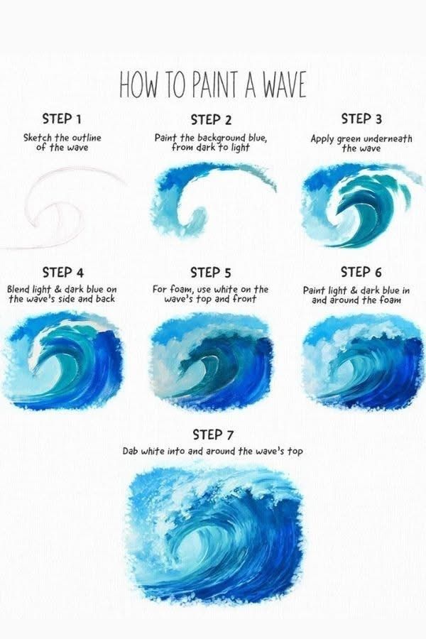
Step-by-Step Watercolor Wave Painting Tutorial
Step 1: Lightly Sketch the Wave Outline Using a soft pencil, draw the basic curving shape of the wave.
- Start with a gentle S-curve for the crest.
- Add the rolling tube underneath and the forward-leaning lip.
- Keep lines very light—they should disappear under paint or be easy to erase. Focus on graceful movement rather than perfect symmetry.
Step 2: Paint the Background Ocean (Dark to Light Gradient) Wet the entire area behind the wave with clean water (wet-on-wet technique).
- Start at the top/horizon with a strong mix of dark blue (Ultramarine + a touch of Payne’s Gray or Phthalo).
- Gradually dilute the color as you move downward, letting it fade into lighter, brighter blue. This creates instant depth and makes the wave feel like it’s emerging from the sea.
Step 3: Add the Green Undertone Beneath the Wave While the background is still damp, drop in a soft band of green (Viridian or Phthalo Green diluted) along the bottom and inside curve of the wave.
- Let the green softly bleed upward into the blue—this mimics the way light filters through shallow water and creates that glowing turquoise base. Tilt your board slightly to encourage natural flow.
Step 4: Build the Wave Body – Blend Light & Dark Blues Now work on the main body of the wave (the curling wall).
- Use a medium-value blue on the side and back of the wave (where light hits).
- Transition to darker blue in the shadowed underside and tube. Work wet-on-damp or wet-on-dry for soft blends—let colors mingle naturally for realistic transitions.
Step 5: Create Realistic White Foam This is where the magic happens.
- Use thick, opaque white (Titanium White watercolor or gouache).
- With a fairly dry brush, dab and stipple white along the top crest and leading edge of the wave.
- Add smaller flecks and streaks inside the curl and spilling forward.
- Leave some blue showing through—foam should never be solid white; it’s translucent and bubbly.
Step 6: Enhance Depth & Movement Around the Foam Go back in with light and dark blues:
- Paint darker blue shadows just behind and beneath the foam to make it “pop.”
- Add lighter blue glints on top of and around the foam to suggest sparkling light.
- Use a clean, damp brush to soften any hard edges.
Step 7: Final Foam Details & Finishing Touches
- Dab more white into and around the top crest, especially where the wave is breaking.
- Add tiny streaks of white trailing down the face of the wave for realistic spray.
- Step back and assess: deepen any shadows that need more contrast, brighten highlights, and refine edges.
- Once completely dry, gently erase any remaining pencil lines.
Key Techniques & Pro Tips
- Water control is everything: Too much water = muddy colors; too little = harsh edges. Practice loading your brush and testing on scrap paper.
- Layering: Build gradually—start light and transparent, then add darker values.
- Edges: Vary hard and soft edges—crisp for foam, soft for water blending.
- Light source: Imagine the sun coming from the upper left or right; keep lightest values and brightest whites on the wave’s illuminated side.
- Avoid overworking: Watercolor shines when it’s fresh and spontaneous—embrace happy accidents!
Common Mistakes to Avoid
- Making the entire wave the same blue → loses depth
- Using pure white everywhere → looks flat and chalky
- Painting foam too early → it gets muddy when layered over
- Forgetting the green undertone → wave looks flat and unrealistic
This wave painting technique creates a timeless, luminous seascape that captures the energy of the ocean. Practice it multiple times—each attempt will teach you more about color flow, value, and timing.
Ready to ride the wave? Grab your brushes and let the water do its magic. Share your finished paintings—we’d love to see your version of this classic subject!
Happy painting! 🌊✨