Mastering Light and Shadow — A Guide to Essential Techniques for Artists
Understanding light and shadow is a fundamental part of every artist’s journey — one that you will inevitably acknowledge at some point.
When mastered, this concept can dramatically enhance your work, adding depth, dimension, and realism — the ultimate goal for most individuals.
Note that shading is more than just filling in dark areas — it’s about observing how light shapes an object and translating that onto paper or canvas.
With that being said, this guide will break down the fundamentals of light and shadow, explore different types of shading, and provide practical techniques to help you refine your artistic skills.
Let’s begin!

Understanding Light: The Key to Depth and Form
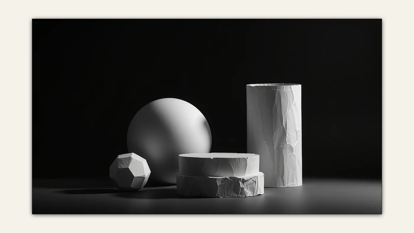
It’s important to understand that light influences every aspect of a scene.
Every shadow, midtone, and highlight in our environment is a direct result of the interaction between light and a subject.
The main job of an artist is to carefully study these dependiencies and carefully break them down.
Before explaining how to organize the scene into a ‘value scale,’ we first need to discuss the characteristics of light and its types.
The Science of Light in Art
I want you to think of light as an invisible force — which it inherently is — that travels through the scene in a straight line until it hits an obstacle.
That’s when the illusion of depth is created.
If an object is fully front-lit, it actually becomes less interesting to us as artists.
That’s because light creates contrast between dark and bright areas, which our eyes instantly detect, making it more attention-grabbing and engaging.
The decision on how strongly you want to push this contrast is entirely up to you, depending on how dramatic you want your story to be.

How Light Behaves
Understanding the role that lighting plays in your picture is important, but it is also good to know how it behaves.
This becomes especially useful when breaking down your lighting scenario. By carefully studying the light in a particular situation, you can achieve more believable results — but we will get to that later.
With that being said, here are the key characteristics of light.
1. Light Travels in Straight Lines
One of the fundamental principles of light behavior is that it moves in straight lines until it interacts with an object or a medium that changes its path.
This means that all the characteristics light inherits result from its interaction with the scene.
Objects can bend, scatter, or change the direction of light beams, but at its core, light does not acquire any new properties.
The best example of this rule is the phenomenon known as light scattering.
I’m sure you’ve encountered a situation where light beams enter a dark room through a small opening.
That’s when you can clearly see a division, creating visible rays.

These processes happen in a fraction of a second, while at the same time, our eyes interpret the image and send information to our brain.
In the end, we perceive a complete picture of the scene.
2. Reflection
When light hits an object, it bounces off the surface, changing its direction.
It is one of the most important characteristics of light, as it allows us to see objects that aren’t directly illuminated by a light source. Without reflection, we would only be able to see objects that are emitting or transmitting light themselves.
Reflection can occur on almost any surface, but its behavior depends on the surface’s nature.
I’ve written an article about different types of surfaces and textures that delves deeper into this concept.
For now, there are two types of reflection that we need to know.
- Specular reflection occurs when light bounces off a smooth surface, like a mirror, at a defined angle. This results in a sharp, clear reflection.
- Diffuse reflection happens when light strikes a rough surface, scattering in many directions, which creates a softer, less defined reflection.

3.Absorption
Absorption occurs when an object takes in more light instead of reflecting or transmitting it.
This characteristic is typical of dark-colored objects, such as black or deep blue, which absorb more light across the visible spectrum.
In contrast, lighter colors, like white or light gray, tend to reflect most of the light that strikes them.

4. Refraction
Refraction is the bending of light as it passes from one medium to another, caused by a change in its speed.
When light enters a new medium at an angle, it slows down or speeds up, causing it to change direction.
The speed of light is faster in air than it is in water, glass, or other denser materials. This change in speed causes the light to bend.

Refraction is particullary useful when drawing a sheet of water.
It helps artists create the distortion of submerged objects, convey depth and transparency, and capture the complex light dynamics of the water’s surface and what lies beneath it.
Recommended Resource for Mastering Color and Light
Based on strong reviews and its reputation in the art community, this book is a highly regarded resource you might find helpful:
Color and Light: A Guide for the Realist Painter by James Gurney on Amazon.
This carefully researched book bridges the gap between abstract theory and practical application, making it a valuable guide for any artist looking to improve their painting skills.
Why You’ll Love This Book:
✅ A deep dive into how light reveals form and the properties of color and pigments.
✅ Insights from underappreciated masters who perfected the use of color and light.
✅ Practical, science-backed explanations that cut through common misconceptions about color theory.
✅ A glossary, pigment index, and bibliography to serve as a long-term reference tool.
Whether you’re a beginner or a seasoned artist, Color and Light will help you elevate your work with a stronger understanding of these essential principles.
Understanding And Applying Values
Now that we understand how light behaves, it’s time to put this knowledge into practice.
An important step in beginning to work with light and shadow is creating a value scale.
Value in art refers to the relative lightness or darkness of a color or shade.
Generally, your artwork should have 3–6 values, including:
- Shadows — The darkest areas where light is blocked or less intense.
- Midtones — The in-between values that transition between light and dark.
- Highlights — The brightest areas where light directly hits the surface.
A great way of showcasing the value range is a value scale.

Breaking Down The Compositions Using Value
By creating your own value scale, you can break down a complex composition into more digestible steps.
Whether using a reference photo or working from life, this practice helps you visualize the entire composition in broader terms without focusing on details first.
Grouping similar values together strengthens readability and creates a more cohesive composition.
As stated before, pick up to three values, ensuring each end of the spectrum is represented — highlights, midtones, and shadows.
Then, without focusing on intricate details, start grouping similar values by drawing shapes for each.

The Elements of Light and Shadow
Each object in a scene that is exposed to a light source will display an individual range of values that define its form.
Of course, by grouping values first, we don’t focus on each individual form right away.
However, as you refine your drawing, you will eventually need to consider which elements are more or less important and how each one interacts with light.
The value scale we used earlier can be applied repeatedly to each object, depending on how structured you want your drawing to be.
But don’t get overwhelmed by trying to shade every tiny crack or detail — focus instead on the most significant elements.
Simply put, values can be broken down into six fundamental elements that describe how light and shadow interact with an object.

Here are six fundamental elements of light and shadow:
- Highlight — The brightest area where the light source directly hits the object. This is the most reflective part of the surface.
- Light — The general lit area that receives direct light but is not as intense as the highlight.
- Midtone (Halftone) — The transition area between light and shadow, where the surface starts to turn away from the light source.
- Core Shadow — The darkest part of the object where light is completely blocked, creating depth and dimension.
- Reflected Light — A subtle light that bounces off surrounding surfaces, illuminating parts of the shadowed area.
- Cast Shadow — The dark shape created by the object blocking the light, extending onto surrounding surfaces.
Setting The Mood For Your Work
Lighting plays a crucial role in establishing the mood and atmosphere of your artwork.
The way you handle light and shadow can completely transform the emotional impact of a piece, guiding the viewer’s perception and engagement.
1. Choosing the Right Light Source
The intensity and direction of your light source influence the feeling of a scene.
A soft, diffused light creates a calm, peaceful atmosphere, while a strong, directional light with deep shadows can add drama and intensity.
2. Contrast and Value Range
High contrast creates drama and mystery, while low contrast with soft transitions feels gentle and dreamy.
Combine sharp, defined edges with soft, blended ones to create focal points and depth.

3. Warm vs. Cool Lighting
Light temperature affects mood — warm tones evoke comfort and energy, while cool tones create calm or mystery.
By juxtaposing warm and cool lighting, you can easily balance the mood of your artwork.
If you want to learn more about how different colors affect your work, I encourage you to check out my article about color theory.

Shading Techniques for Artists
Depending on your medium, there are countless techniques for laying in light and shadow.
For the sake of efficiency, we will focus on graphite, charcoal and fineliners, as these can be easily recreated digitally.
Blocking In
Blocking in focuses on large areas of shadow or light without worrying about fine details.
A great way to start the blocking phase is by outlining the general shape of your structure.
Then, using a hard pencil, like an HB (or a low-opacity brush digitally), begin filling in the areas that will be in shadow.
Next, gradually switch to softer pencils, such as B2 to B6, to add more bold shadows.
Finally, you can use a blending stump (or smudge tool digitally) to blend and refine your shadows.

Pencil Hardness
Pencils are typically graded using a scale that includes numbers and letters.
The scale ranges from H (hard) to B (soft), with H indicating a harder pencil and B indicating a softer one.
The harder the pencil, the lighter the mark it produces, while softer pencils leave darker, richer marks. The scale often includes:
- H (Hard): Pencils like 2H, 4H, 6H, etc., create lighter, finer lines and are ideal for fine details and light shading.
- B (Soft): Pencils like 2B, 4B, 6B, etc., create darker, bolder lines and are perfect for deep shadows and rich tonal value.
- F (Fine Point): This is a neutral grade between hard and soft pencils, offering a good balance for general drawing.
✏️ Upgrade Your Drawing Tools with Faber-Castell Pencils!
The Faber-Castell 9000 Design Pencil Set (Pack of 12) offers a full range of H to B grades, perfect for everything from fine details to deep shadows.
✅ Smooth, break-resistant graphite for effortless sketching
✅ Full hardness range (6H–8B) for versatile shading and line work
✅ Excellent quality widely used by artists
Other Shading Techniques
Other shading techniques involve tools that produce only one type of value, such as fineliners, which can be used to create depth and volume.
However, when working with fineliners, we are limited in creating a full value scale, as this tool doesn’t produce gradients.
As a result, we are restricted to working primarily with lines.
This is where techniques like hatching, cross-hatching, and stippling become useful.
- Hatching
Hatching uses parallel lines to create tonal variation. Closer lines result in darker areas, while wider spacing creates lighter tones. It’s great for fine details and subtle gradation. - Cross-Hatching
Cross-hatching layers intersecting lines at different angles to build texture and darken areas. It’s perfect for deep shadows and detailed shading. - Stippling
Stippling uses dots to create tonal variation, with denser dots creating darker areas. It’s ideal for smooth transitions and detailed, textured effects.

Tips for Applying Light and Shadow
Now that you have a theoretical understanding of light and shadow, it’s time to apply it!
I’ll share a few useful tips, but remember — the best way to reinforce this knowledge is through consistent practice.
Choosing Right Reference Photo
The best practice is to observe natural environments and their lighting.
However, beginners may find it challenging to accurately draw their surroundings, which is why choosing the right reference photo is essential.
Always look for a full value range and high-quality images to achieve the best results.
I personally recommend Unsplash or Pexels for high-quality photos, but Google Images can work as well.

Breaking Down Your Image
As we learned earlier, the best way to achieve unique results is by breaking down your image into a value scale.
At first, this may seem like a tedious and technical step, but with practice, you’ll train your eye to recognize different values effortlessly.
Always keep in mind how contrast and colors influence the overall mood of your work.
With enough practice, you’ll be able to create your own lighting scenarios.
Final Words
I hope this guide helped clarify this complex concept for you.
I highly encourage you to check out my other articles on various art-related topics — you might find something useful!
If you enjoyed this article, feel free to share your thoughts in the comments and give it a clap.
Thanks for sticking around!