Mastering the Rule of Thirds in Landscape Composition: A Comprehensive Tutorial

Introduction to the Rule of Thirds
In the world of visual arts, photography, and graphic design, composition is the foundation of creating compelling and balanced images. One of the most fundamental principles guiding effective composition is the Rule of Thirds. This technique, rooted in classical art theories and popularized in modern photography, helps artists and creators avoid centering subjects in a way that can make compositions feel static or uninspired. Instead, it encourages placing key elements off-center to draw the viewer’s eye naturally through the frame, fostering a sense of dynamism, balance, and engagement.
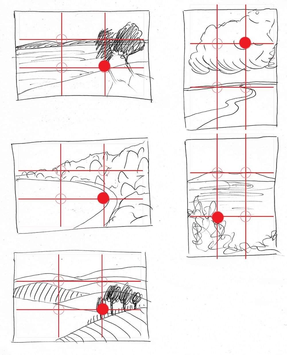
The image provided serves as an excellent visual aid for this tutorial. It consists of six hand-drawn landscape sketches, each overlaid with a 3×3 grid formed by two horizontal and two vertical red lines, dividing the frame into nine equal parts. At the intersections of these lines—known as “power points”—a red dot highlights the placement of a primary focal element in each sketch. These examples demonstrate how the Rule of Thirds can be applied to various landscape scenarios, from serene horizons to dramatic cloud formations. By analyzing these illustrations, we’ll break down the rule step by step, explore its applications, and provide practical tips for incorporating it into your own work.
Whether you’re a beginner artist sketching landscapes, a photographer capturing nature scenes, or a digital creator designing website visuals, this tutorial will equip you with the knowledge to elevate your compositions. We’ll use the provided image as a reference throughout, referring to the sketches by their positions (top-left, top-right, middle-left, middle-right, bottom-left, and bottom-right) for clarity.
Understanding the Basics of the Rule of Thirds
Step 1: Dividing the Frame
The Rule of Thirds begins with mentally (or literally, as in our image) dividing your canvas, viewfinder, or screen into thirds both horizontally and vertically. This creates a grid with four intersection points, often called “power points” or “golden points,” where the eye is naturally drawn.
- Horizontal Division: Imagine two lines splitting the height into three equal parts. The top third might contain skies or distant elements, the middle third the main subject or action, and the bottom third the foreground or grounding features.
- Vertical Division: Similarly, two lines divide the width into thirds, helping to position elements left, center, or right without symmetry.
In the provided image, each sketch features this grid in red, with small circles at the intersections to emphasize the power points. A solid red dot marks the exact placement of the focal element on one of these points, illustrating intentional composition choices.
Step 2: Placing Key Elements
The core idea is to align important subjects or lines (like horizons) with the grid lines or intersections rather than centering them. This creates visual tension and guides the viewer’s gaze across the image.
- Focal Points at Intersections: Place your main subject (e.g., a tree, mountain, or sun) at one of the four power points.
- Horizons on Grid Lines: For landscapes, align the horizon with the top or bottom horizontal third line to avoid splitting the image evenly, which can feel unbalanced.
Research from visual psychology shows that off-center compositions mimic how humans scan environments, making images more intuitive and engaging. Avoid the “bullseye” effect of centering everything, as it can make your work feel predictable.
Analyzing the Example Sketches: Practical Applications
Let’s dissect the six sketches in the image to see the Rule of Thirds in action. Each one represents a common landscape motif, with the red dot pinpointing the primary focal point. This hands-on breakdown will show how small adjustments in placement can transform a simple drawing into a professional composition.
Sketch 1 (Top-Left): Tree on a Horizon
- Description: A flat horizon line suggests a vast plain or sea, with a solitary tree rising prominently. The red dot is placed at the bottom-center intersection, aligning the tree’s base with the lower horizontal third and the central vertical third.
- Tutorial Insight: This placement draws the eye to the tree as the anchor, while the empty space around it emphasizes isolation and scale. In practice, when drawing or photographing a lone subject in a wide landscape, use the lower intersections for grounded elements like trees or rocks. This creates depth, as the upper two-thirds can be dedicated to sky, evoking openness. Pro Tip: If your horizon is low (as here), it amplifies the sky’s drama; experiment by sketching variations where the tree shifts to the left or right intersection for asymmetry.
Sketch 2 (Top-Right): Sun and Winding Path
- Description: A cloudy sky with a sun peeking through, and a meandering river or path below. The red dot is at the top-right intersection, highlighting the sun.
- Tutorial Insight: Positioning the sun off-center in the upper third adds energy, as if it’s “pulling” the viewer’s eye along the path. Landscapes with leading lines (like the river) benefit from this—align the line’s origin or end with a power point. In photography, this is ideal for sunsets; place the sun at an upper intersection to balance the frame with foreground details. Exercise: Redraw this with the sun centered—notice how it flattens the composition? The Rule of Thirds restores movement.
Sketch 3 (Middle-Left): Mountain Valley
- Description: Jagged mountains frame a curving valley or path, with the red dot at the bottom-center intersection, emphasizing a dip in the terrain.
- Tutorial Insight: Here, the focal point is a convergence in the landscape, placed low to allow the mountains to dominate the upper thirds. This builds a sense of journey, guiding the eye from foreground to background. For hilly or mountainous scenes, use lower power points for paths or valleys to create leading depth. Digital Tip: In software like Photoshop or Procreate, overlay a thirds grid (most tools have this feature) and snap elements to intersections for precision.
Sketch 4 (Middle-Right): Cloud Formation
- Description: Swirling clouds over a subtle horizon, with the red dot at the bottom-right intersection amid the clouds’ base.
- Tutorial Insight: Clouds as subjects thrive when offset; this placement contrasts the ethereal upper space with a grounded horizon. It teaches that even abstract elements like weather can be “anchored” at power points. In tutorials for beginners, emphasize varying cloud density—denser at the dot for emphasis. Application: For stormy skies, position dramatic clouds at upper intersections to convey impending action.
Sketch 5 (Bottom-Left): Rolling Hills with Trees
- Description: Layered hills resembling plowed fields, with a cluster of trees. The red dot is at the bottom-center intersection, spotlighting the trees on a ridge.
- Tutorial Insight: This illustrates layering in landscapes: Foreground hills in the bottom third, midground trees at the power point, and background fading. The offset trees add rhythm without overwhelming the frame. Practice Step: Start with a blank grid, sketch hills aligning with horizontal thirds, then add trees at intersections. This builds muscle memory for balanced multi-layered compositions.
Sketch 6 (Bottom-Right): Expansive Plains
- Description: Gentle undulating plains or fields, with the red dot at the bottom-center intersection near subtle tree-like forms.
- Tutorial Insight: Similar to Sketch 1 but with more texture, this emphasizes minimalism. The low placement grounds the viewer, using negative space in the upper thirds for tranquility. Ideal for serene scenes; in web design, apply this to hero images where text overlays the empty thirds.
Advanced Tips for Implementing the Rule of Thirds
Breaking the Rule Intentionally
While the Rule of Thirds is a guideline, not a law, mastering it allows you to break it effectively. For symmetrical subjects (e.g., reflections), centering can work, but start with thirds as your default.
Tools and Resources
- Digital Aids: Apps like Lightroom or Camera apps have built-in thirds grids.
- Practice Exercises: Draw 10 quick sketches daily, using a grid template. Reference images like the one provided to vary themes.
- Common Mistakes to Avoid: Overcrowding power points—limit to 1-2 focal elements. Ignoring balance—if one side is heavy, counter with subtle details on the opposite.
Integrating with Other Principles
Combine with leading lines (as in Sketch 2), symmetry, or color theory for pro-level results. For website posts, use thirds to position calls-to-action or images for better user flow.
Conclusion: Elevate Your Art with Intentional Composition
By studying the six sketches in the provided image, you’ve seen how the Rule of Thirds transforms basic landscapes into captivating visuals. This tutorial has equipped you with the steps to apply it: divide the frame, place elements strategically, and iterate for balance. Practice consistently, and soon you’ll intuitively compose like a professional. Share your own grid-overlaid sketches in the comments below—what’s your favorite application of this rule? For more tutorials, explore our series on visual principles.