Mastering Shape Contrast in Rock and Environment Design: A Comprehensive Tutorial on Creating Dramatic, Believable Forms

In the world of concept art, illustration, and 3D environment design, shape contrast is one of the most powerful tools for creating visual interest, depth, and believability. This in-depth tutorial, inspired by professional artist Isaac Orloff, breaks down the fundamental principles of shape language using rocks as a practical example—principles that apply universally to organic forms, architecture, character silhouettes, and interior spaces.
Why Shape Contrast Matters
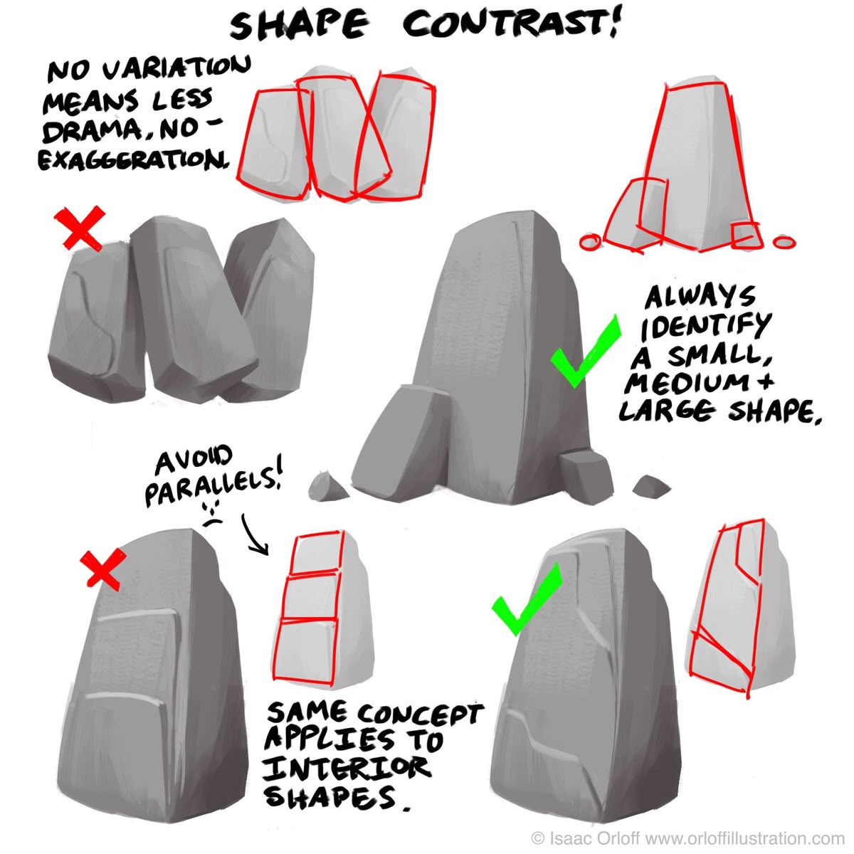
Without variation in scale, angle, and silhouette, forms become flat, repetitive, and visually unengaging. As Isaac Orloff illustrates:
“No variation means less drama, no exaggeration.”
Even the most technically polished rendering will fall flat if the underlying structure lacks hierarchy and rhythm. Shape contrast gives your audience something to follow—guiding the eye, creating focal points, and adding narrative weight to your designs.
Core Principle: The Small, Medium, Large Rule
Always identify a small, medium, and large shape.
This is the golden rule of dynamic form design. Whether you’re sculpting a boulder, designing a mountain range, or blocking in an interior room, scale variation is non-negotiable.
✅ Do This:
- Large Shape: The dominant mass (e.g., the main body of the rock).
- Medium Shape: A secondary form that breaks the silhouette (e.g., a protruding ledge or overhang).
- Small Shape: Subtle details that add texture and realism (e.g., cracks, chipped edges, or debris).
This hierarchy creates visual rhythm and prevents monotony.
❌ Avoid This:
- Parallel edges
- Uniform thickness
- Symmetrical stacking
- Equal spacing between forms
These create visual stagnation. Even subtle parallels (like stacked rectangular layers) should be broken with angle shifts, overlaps, or asymmetry.
Practical Application: Rock Design Breakdown
Let’s analyze the examples step by step:
Example 1: The Failure of Uniformity
- Three identical vertical slabs
- Red outline reveals repetitive silhouette
- No hierarchy, no focal point
- Result: Boring, inorganic, and unconvincing
Lesson: Never repeat the same shape, angle, or scale without intentional variation.
Example 2: The Power of Hierarchy
- Large dominant rock
- Medium supporting form leaning against it
- Small debris and fragments at the base
- Green checkmark of approval
Result: Instantly readable, dramatic, and geologically plausible.
Example 3: Avoiding Parallel Traps
- Left: A rock with flat, layered parallels → X (Fail)
- Center: A cylindrical form with even banding → X (Fail)
- Right: Organic, irregular fracturing with varied angles → ✓ (Success)
Key Insight: Break parallels at every opportunity. Use tilts, overhangs, fractures, and erosion patterns to disrupt symmetry.
Bonus: Interior Shape Design
The same concept applies to man-made environments:
- Large: The room’s overall volume
- Medium: Furniture, doorways, arches
- Small: Decorative molding, light fixtures, textures
Avoid parallel walls, evenly spaced columns, or identical window sizes unless stylistically intentional (e.g., Brutalism). Introduce cantilevered platforms, recessed alcoves, and asymmetrical shelving to enrich spatial storytelling.
Actionable Checklist for Shape Contrast
Before finalizing any form, ask:
- □ Do I have a clear large, medium, and small shape?
- □ Are there parallel edges I can break?
- □ Does the silhouette read strongly from a distance?
- □ Are angles varied (sharp, soft, diagonal, curved)?
- □ Is there overlap and intersection between forms?
Final Thoughts
Shape contrast isn’t just about aesthetics—it’s about communication. A well-designed rock tells a story of erosion, impact, and time. A dynamic interior suggests function, history, and mood.
Master this principle, and every form you create—organic or architectural—will carry weight, drama, and professional polish.
Artist Credit: Isaac Orloff – www.orloffillustration.com Tutorial by: [Your Studio/Name] – Concept Art & Design Education
Share this tutorial with your team or save it for your next environment blockout. Strong shapes = stronger art.