🖊️ Top Section: Linear Texture

-
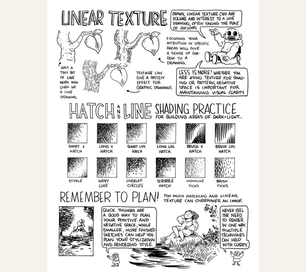
Purpose: Adds volume and interest, can replace outlines.
-
Key Advice:
-
Use selective line work to guide the viewer’s eye.
-
Focus on texture in specific areas to suggest light and shadow.
-
“Less is more” — too much texture can overwhelm your image.
-
-
Example Uses:
-
Leaves, bark, clothing folds, or shadows on a figure.
-
Makes areas feel tactile and dimensional without heavy shading.
-
🧩 Middle Section: Hatch and Line Shading Practice
A toolbox of techniques for building tone and depth:
| Technique | Description |
|---|---|
| Short x Hatch | Dense crisscross lines for tight shadow |
| Long x Hatch | Same concept, but with longer strokes |
| Short Lin. Hatch | One direction, shorter lines |
| Long Lin. Hatch | Great for gentle gradients |
| Brush x Hatch | Bolder, painterly look with more texture |
| Brush Lin. Hatch | Stronger lines for deep shadow or stylized edges |
| Stipple | Dots for subtle tone—great for slow build-up of shadows |
| Wavy Line | Organic feel, useful for nature or water textures |
| Overlap Circles | Soft, sketchy shading (a common pencil technique) |
| Scribble Hatch | Freestyle texture—useful for chaotic or dense areas |
| Monoline Ticks | Controlled, even spacing; good for gentle transitions |
| Brush Ticks | Adds more pressure variation and texture |
🧠 Bottom Section: Remember to Plan!
-
Use thumbnail sketches to test layout and texture balance.
-
Sketch in small scale to plan positive/negative space.
-
Try combining techniques for better clarity and style.
-
Don’t over-render; it can make your image busy and hard to read.
✅ Final Takeaways:
-
Balance is key: too much hatching or texture can crowd an image.
-
Planning helps avoid overworking areas.
-
Use texture to enhance form, not just fill space.