The Artist’s First Guide to Composition: Essential Principles and Techniques for Creating Balanced, Engaging Visual Art

Composition is the foundation of every powerful drawing, painting, photograph, or design. It determines how the viewer’s eye moves through your work, where attention is directed, and how emotional impact is delivered. This beginner-to-intermediate guide distills the most important and time-tested principles of composition into clear, practical concepts—illustrated with simple yet effective diagrams.
Whether you’re just starting out or looking to strengthen your intuitive sense of arrangement, mastering these tools will dramatically improve the strength and professionalism of your artwork.
Core Composition Principles Covered
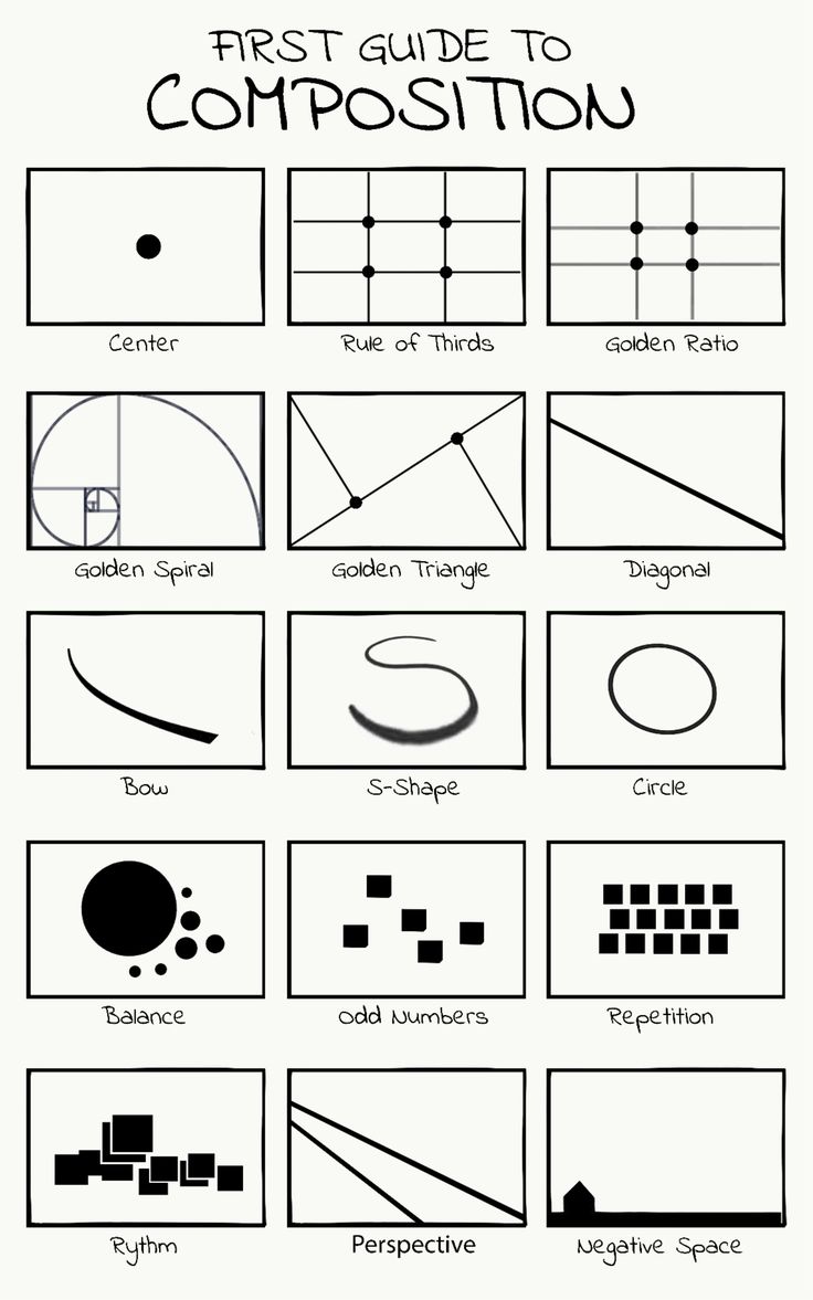
- Center Composition Placing the main subject directly in the middle of the frame creates symmetry, stability, and immediate focus. Ideal for portraits, icons, meditative scenes, or subjects that demand undivided attention. While powerful, it can sometimes feel static—use it intentionally when calm or monumental impact is desired.
- Rule of Thirds The most widely taught and versatile guideline: divide your canvas into three equal parts horizontally and vertically (creating a 3×3 grid). Place key elements along these lines or—most importantly—at their intersections. This off-center placement feels more dynamic and natural to the human eye than perfect centering.
- Golden Ratio & Golden Spiral Based on the mathematical ratio ≈1.618 (the “divine proportion”), this creates harmonious, aesthetically pleasing divisions.
- Place important elements along the lines or at intersection points of the Golden Rectangle.
- The Golden Spiral naturally guides the eye in a flowing, organic path—perfect for leading viewers through complex scenes (landscapes, still lifes, figure compositions).
- Golden Triangle Divide the canvas with two diagonals from opposite corners, then draw lines from the remaining corners to the intersection point. This creates four triangular zones. Positioning focal points within these triangles or along their edges produces elegant, asymmetrical balance.
- Diagonal Composition Strong diagonal lines (from corner to corner or strong implied angles) add energy, movement, and tension. Great for action scenes, dramatic portraits, or any work that needs visual momentum.
- Curved Flow Lines: Bow, S-Shape & Circle
- Bow (C-curve) — Gentle, sweeping arc that invites the eye to follow softly.
- S-Shape — Elegant, flowing double curve; one of the most pleasing and dynamic paths in art (rivers, roads, reclining figures).
- Circle — Creates enclosed, contained energy; draws the viewer inward and holds attention within the frame.
- Balance Visual weight distribution: symmetrical (formal balance) or asymmetrical (dynamic balance). Large dark shapes can be balanced by small bright ones, heavy masses by distant light forms, or complex details by simple negative space.
- Odd Numbers Groups of three, five, or seven elements feel more natural and interesting than even numbers. Odd groupings avoid symmetry and create subtle tension that engages the viewer longer.
- Repetition & Rhythm Repeating shapes, colors, lines, or motifs creates unity and visual music. Vary size, spacing, or orientation slightly to build rhythm instead of monotony.
- Perspective Linear perspective naturally leads the eye deep into the picture plane. Use converging lines, diminishing scale, and atmospheric effects to reinforce depth and guide attention toward your focal point.
- Negative Space The empty areas around and between subjects are just as important as the subjects themselves. Strong use of negative space creates breathing room, emphasizes the main subject, and can form powerful secondary shapes (figure-ground relationships).
How to Apply These Principles in Practice
- Start with Thumbnails Make 5–10 small (2×3 inch) quick sketches of your idea using different compositional devices. Compare which version feels strongest.
- Choose One or Two Dominant Principles Don’t try to use every rule at once. Pick a primary structure (e.g., Rule of Thirds + S-curve) and let others support it subtly.
- Create Movement & Hierarchy Lead the viewer’s eye in a deliberate path: entry point → focal point → secondary elements → exit (or loop back).
- Test for Balance Squint your eyes or flip your canvas horizontally/vertically to check if the composition still feels harmonious.
- Use the Mirror Test Hold your work up to a mirror (or flip digitally). If it still reads strongly, the composition is robust.
Quick Reference Checklist for Any Artwork
- Where is the focal point? (Usually at a power point: thirds intersection, golden ratio point, etc.)
- Is there a clear path for the eye?
- Does the composition feel balanced (symmetrical or asymmetrical)?
- Are there areas of rest (negative space)?
- Does the work have movement and energy?
- Does it feel unified yet varied?
Mastering composition is less about following rigid rules and more about developing an intuitive sense of visual harmony. These foundational tools give you the language to understand why certain arrangements feel right—and others fall flat.
Practice by intentionally applying one principle per sketch session. Over time, you’ll begin to combine them naturally, creating compositions that feel effortless and compelling.
Start today: take your next subject and explore it through at least three different compositional frameworks from this guide. You’ll be amazed at how quickly your work gains strength and sophistication.
Happy composing!