Mastering Mark-Making: A Guide to Size, Spacing, Layers, Direction, and Weight

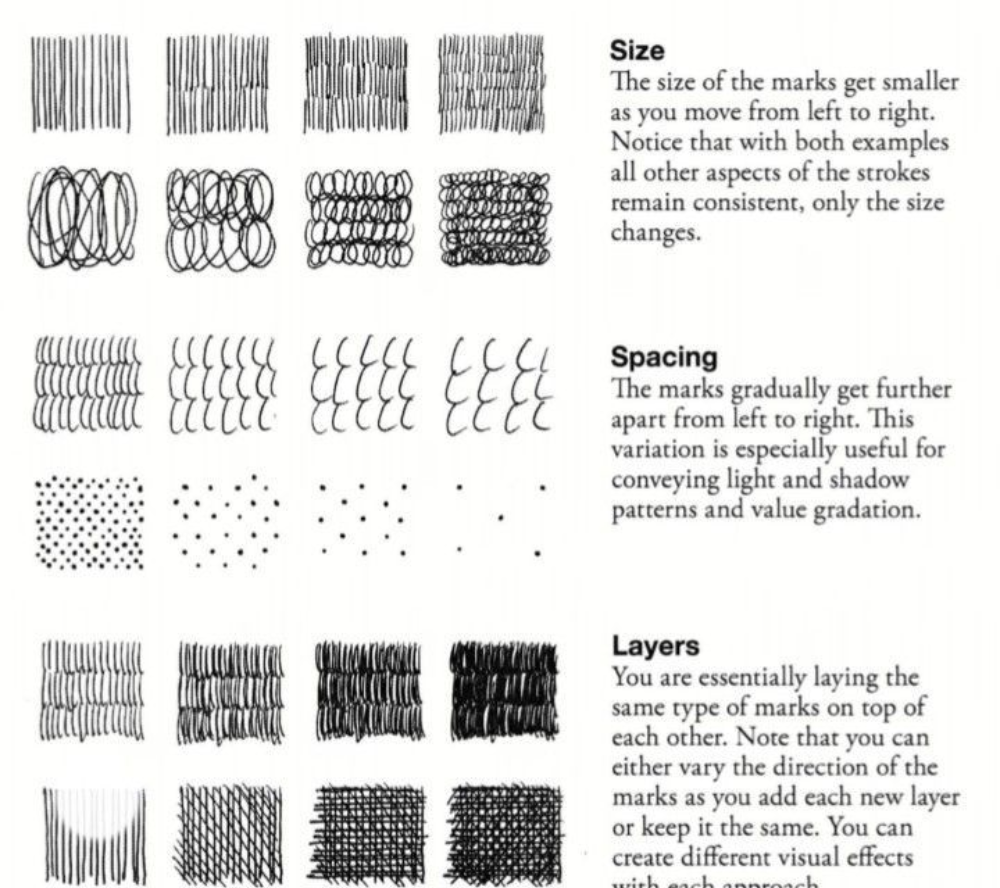
This image is a comprehensive exercise sheet focused on refining fundamental drawing techniques through controlled variations in mark-making. Each section highlights a specific aspect of strokes, demonstrating how subtle changes can dramatically alter texture, depth, and form in artwork.
1. Size
Key Concept: Gradual reduction in mark size from left to right.
-
Purpose: Teaches control over scale while maintaining consistency in pressure, spacing, and direction.
-
Application:
-
Use for perspective (e.g., distant objects smaller).
-
Create focal points (larger marks draw attention).
-
-
Example:
-
A row of dots or lines shrinking uniformly, like a vanishing point exercise.
-
2. Spacing
Key Concept: Incremental increase in space between marks.
-
Purpose: Simulates light/shadow gradients and value transitions.
-
Application:
-
Shading (dense = dark, sparse = light).
-
Organic textures (e.g., stippled skin or rough surfaces).
-
-
Tip: Combine with size variation for atmospheric depth.
3. Layers
Key Concept: Overlaying marks with directional consistency or variation.
-
Purpose: Builds complexity and texture.
-
Approaches:
-
Uniform Direction: Creates woven or fabric-like textures (e.g., basketweave).
-
Varied Direction: Cross-hatching for volumetric shading (e.g., rounded forms).
-
-
Example:
-
First layer: Horizontal lines.
-
Second layer: Diagonal lines for shadow emphasis.
-
4. Direction
Key Concept: Changing stroke angles to define form and texture.
-
Purpose:
-
Mimics cross-contours (e.g., wrapping lines around a sphere).
-
Adds dynamism (e.g., wind-blown grass).
-
-
Application:
-
Parallel Directions: Smooth, flat surfaces.
-
Converging Directions: Curved or irregular objects (e.g., tree bark).
-
5. Weight
Key Concept: Varying line thickness to imply mass, depth, or light.
-
Purpose:
-
Outlines: Thicker lines advance, thinner lines recede.
-
Value Gradation: Heavy strokes = shadow; light strokes = highlight.
-
-
Techniques:
-
Pressure Sensitivity: Press hard for bold lines, lightly for delicate ones.
-
Tapering: Start thick, end thin (e.g., calligraphic strokes).
-
Practical Takeaways
-
Warm-Up: Practice each variation daily to build muscle memory.
-
Texture Library: Combine techniques (e.g., layered + directional marks for wood grain).
-
Depth Tricks: Use weight + spacing to suggest 3D forms without shading.
Why It Matters: These exercises are the backbone of technical drawing, illustration, and even digital art, enabling artists to manipulate perception with minimal marks.
Need Visual Examples? I can sketch how these techniques apply to real objects (e.g., an apple’s contour vs. fabric folds). Let me know!